Category Archives: Energy analysis and reporting

Common weaknesses in M&T software

ONE OF MY GREAT FRUSTRATIONS when training people in the analysis and presentation of energy consumption data is that there are very few commercial software products that do the job sufficiently well to deserve recommendation. If any developers out there are interested, these are some of the things you’re typically getting wrong:

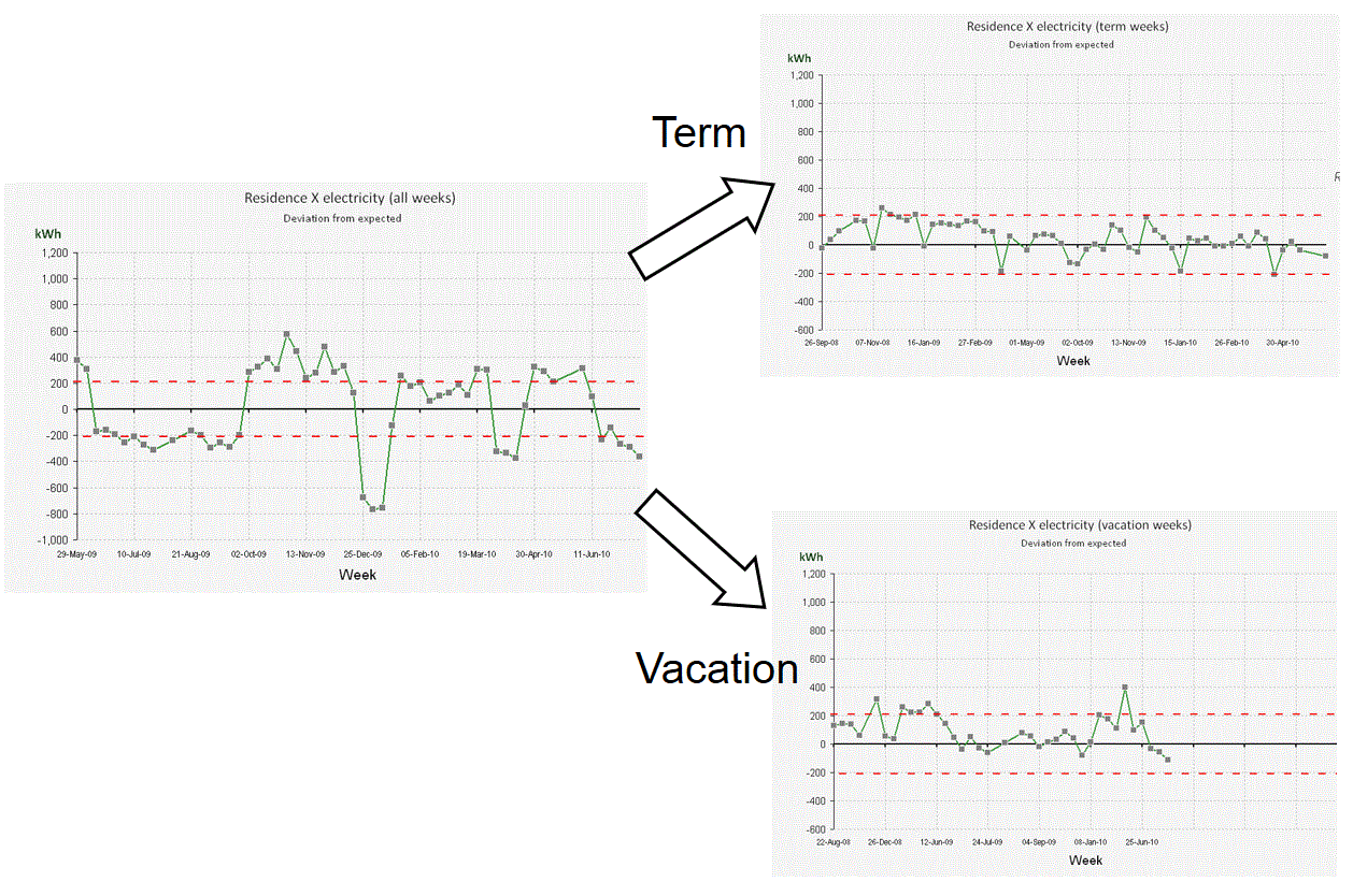
1. Passive cusum charts: energy M&T software usually includes cusum charting because it is widely recognised as a desirable feature. The majority of products, however, fail to exploit cusum’s potential as a diagnostic aid, and treat it as nothing more than a passive reporting tool. What could you do better? The key thing is to let the user interactively select segments of the cusum history for analysis. This allows them, for example, to pick periods of sustained favourable performance in order to set ‘tough but achievable’ performance targets; or to diagnose behaviour during abnormal periods. Being able to identify the timing, magnitude and nature of an adverse change in performance as part of a desktop analysis is a powerful facility that good M&T software should provide.

2. Dumb exception criteria: if your M&T software flags exceptions based on a global percentage threshold, it is underpowered in two respects. For one thing the cost of a given percentage deviation crucially depends on the size of the underlying consumption and the unit price of the commodity in question. Too many users are seeing a clutter of alerts about what are actually trivial overspends.

Secondly, different percentages are appropriate in different cases. Fixed-percentage thresholds are weak because they are arbitrary: set the limit too low, and you clutter your exception reports with alerts which are in reality just normal random variations. Set the threshold too high, and solvable problems slip unchallenged under the radar. The answer is to set a separate threshold individually for each consumption stream. It sounds like a lot of work, but it isn’t; it should be be easy to build the required statistical analysis into the software.

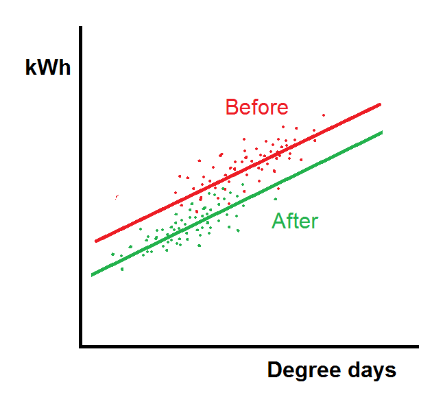
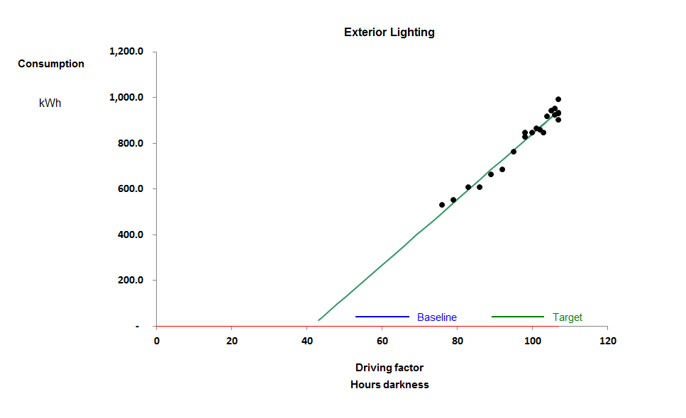
3. Precedent-based targets: just comparing current consumption with past periods is a weak method. Not only is it based on the false premise that prevailing conditions will have been the same; if the users happens to suffer an incident that wastes energy, it creates a licence to do the same a year later. There are fundamentally better ways to compute comparison values, based on known relationships between consumption and relevant driving factors.

Tip: if your software does not treat degree-day figures, production statistics etc as equal to consumption data in importance, you have a fundamental problem

4. Showing you everything: sometimes the reporting philosophy seems to be “we’ve collected all this data so we’d better prove it”, and the software makes no attempt to filter or prioritise the information it handles. A few simple rules are worth following.

  1. Your first line of defence can be a weekly exception report (daily if you are super-keen);
  2. The exception report should prioritise incidents by the cost of the deviations from expected consumption;
  3. It should filter out or de-emphasise those that fall within their customary bounds of variability;
  4. Only in significant and exceptional cases should it be necessary to examine detailed records.

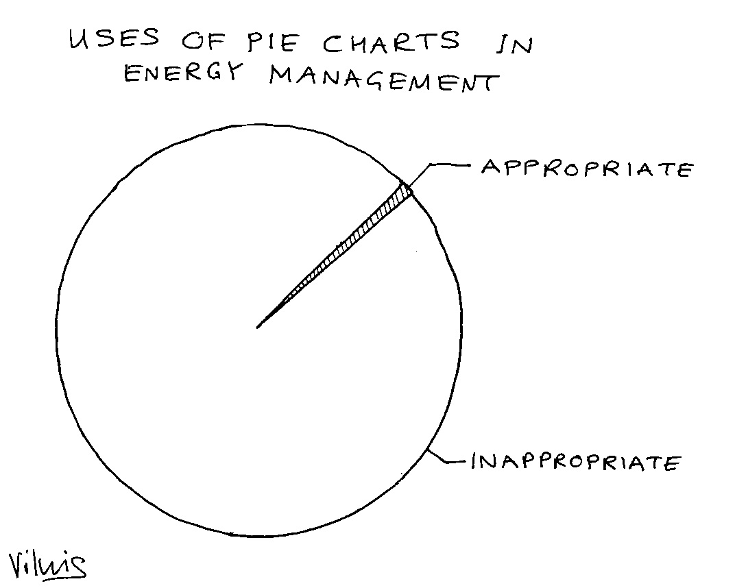
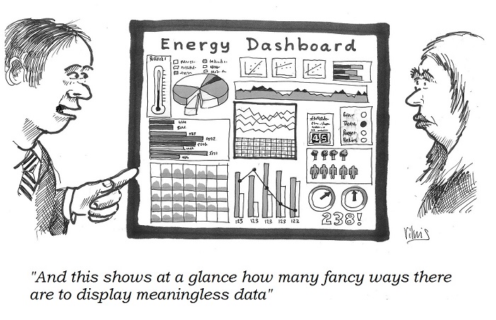
5. Bells and whistles: presumably in order to give salesmen something to wow prospective customers, M&T software commonly employs gratuitous animation, 3-D effects, superfluous colour and tricksy elements like speedometer dials. Ridiculously cluttered ‘dashboards’ are the order of the day.

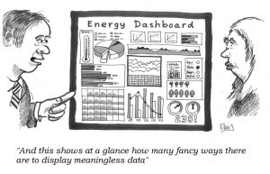
Tip: please, please read Stephen Few’s book “Information dashboard design”


Current details of my courses and masterclasses on monitoring and targeting can be found here

Energy monitoring of multi-modal objects

Background: conventional energy monitoring

In classic monitoring and targeting practice, consumption is logged at regular intervals along with relevant associated driving factors and a formula is derived which computes expected consumption from those factors. A common example would be expected fuel consumption for space heating, calculated from measured local degree-day values via a simple straight-line relationship whereby expected consumption equals a certain fixed amount per week plus so many kWh per degree-day. Using this simple mathematical model, weekly actual consumptions can then be judged against expected values to reveal divergence from efficient operation regardless of weather variations. The same principle applies in energy-intensive manufacturing, external lighting, air compressors, vehicles and any other situation where variation in consumption is driven by variation in one or more independently measurable factors. The expected-consumption models may be simple or complex.

Comparing actual and expected consumptions through time gives us valuable graphical views such as control charts and cusum charts. These of course rely on the data being sequential, i.e., in the correct chronological sequence, but they do not necessarily need the data to be consecutive. That is to say, it is permissible to have gaps, for instance to skip invalid or missing measurements.

The Brigadoon method

“Brigadoon” is a 1940s Broadway musical about a mythical Highland village that appears in the real world for only one day a year (although as far as its inhabitants are concerned time is continuous) and its plot concerns two tourists who happen upon this remote spot on the day that the village is there. The story came to mind some years ago when I was struggling to deal with energy monitoring of student residences. Weekly fuel consumption naturally dropped during vacations (or should do) and I realised I would need two different expected-consumption models, one for occupied weeks and another for unoccupied weeks using degree-days computed to a lower base temperature. One way to accommodate this was to have a single more complex model that took the term/vacation state into account. In the event I opted for splitting the data history into two: one for term weeks, and the other for vacation weeks. Each history thus had very long gaps in it, but there is no objection to closing up the gaps so that in effect the last week of each term is immediately followed by the first week of the next and likewise for vacations.

This strategy made the single building into two different ones. Somewhat like Brigadoon, the ‘vacant’ manifestation of the building for instance only comes into existence outside term time, but it appears to have a continuous history. The diagram below shows the control chart using a single degree-day model on the left, as per conventional practice, while on the right we see the separate control charts for the two virtual buildings, plotted with the same limits to show the reduction in modelling error.

Not just space heating

This principle can be used in many situations. I have used it very successfully on distillation columns in a chemical works to eliminate non-steady-state operation. I recommended it for a dairy processing plant with automatic meter reading where the night shift only does cleaning while the day shift does production: the meters can be read at shift change to give separate ‘active’ and ‘cleaning’ histories for every week. A friend recently asked me to look at data collected from a number of kilns with batch firing times extending over days, processing different products; here it will be possible to split the histories by firing programme: one history for programme 20, another for 13, and so on.

Nice try, but…

A recent issue of the CIBSE Journal, which one would have thought ought to have high editorial standards, recently published an article which was basically a puff piece for a certain boiler water additive. It contained some fairly odd assertions, such as that the water in the system would heat up faster but somehow cool down more slowly. Leaving aside the fact that large systems in fact operate at steady water temperatures, this would be magic indeed. The author suggested that the additive reduced the insulating effect of  steam bubbles on the heat-exchanger surface, and thus improved heat transfer. He may have been taking the word ‘boiler’ too literally because of course steam bubbles don’t normally occur in a low or medium-temperature hot water boiler, and if they did, I defy him to explain how they would interfere with heat transfer in the heat emitters.

But for me the best bit was a chart relating to an evaluation of the product in situ. A scatter diagram compared the before-and-after relationships between fuel consumption and degree days (a proxy for heating load). This is good: it is the sort of analysis one might expect to see,

The chart looked like this, and I can’t argue that performance is better after than before. The problem is that this chart does not tell quite the story they wanted. The claim for the additive is that it improves heat transfer; the reduction in fuel consumption should therefore be proportional to load, and the ‘after’ line ought really to have a shallower gradient as well as a lower intercept. If the intercept reduces but the gradient stays the same, as happened here, it is because some fixed load (such as boiler standing losses) has disappeared. One cannot help wondering whether they had idle boilers in circuit before the system was dosed, but not afterwards.

The analysis illustrated here is among the useful techniques people learn on my energy monitoring and targeting courses.

Daylight-linked consumption

When monitoring consumption in outside lighting circuits with photocell control, it is reasonable to expect weekly consumption to vary according to how many hours of darkness there were. And that’s exactly what we can see here in this Spanish car park:

It is a textbook example: with the exception of two weeks, it shows the tighest correlation that I have ever seen in any energy-consuming system.

The negative intercept is interesting, and a glance at the daily demand profile (viewed as a heatmap) shows how it comes about:

Moving left to right we see from January to March the duration of daylight (zero consumption in blue) increases. High consumption starts at dusk and finishes at dawn, but from about 10 p.m. to 5 a.m. it drops back to a low level. It is this “missing” consumption for about seven hours in the night which creates the negative intercept. If they kept all the lights on from dusk to dawn the line would go through the origin.

For weekly and monthly tabulations of hours of darkness (suitable for England and other countries on similar latitudes)  click here.


Energy Savings Opportunity Scheme

ESOS is the UK government’s scheme for mandatory energy assessments which must be reviewed and signed off by lead assessors who are on one of the approved registers. We are now in the third compliance period, with an original submission deadline of 5 December 2023 postponed to 5 June 2024 to give the Government time to change the Regulations and make them more onerous.

I run a closed LinkedIn group for people actively engaged with ESOS; it provides a useful forum with high-quality discussion.

Background reading

Responsible undertaking contacts: ESOS lead assessors can notify the EA in bulk of the contacts in each Responsible Undertaking using this spreadsheet .

Pitfalls of regression analysis: case study

I began monitoring this external lighting circuit at a retail park in the autumn of 2016. It seems from the scatter diagram below that it exhibits weekly consumption which is well-correlated with changing daylight availability expressed as effective hours of darkness per week.

The only anomaly is the implied negative intercept, which I will return to later; when you view actual against expected consumption, as below, the relationship seems perfectly rational:


Consumption follows the annual sinusoidal profile that you might expect.

But what about that negative intercept? The model appears to predict close to zero consumption in the summer weeks, when there would still be roughly six hours a night of darkness. One explanation could be that the lights are actually habitually turned off in the middle of the night for six hours when there is no activity. That is entirely plausible, and it is a regime that does apply in some places, but not here. For evidence see the ‘heatmap’ view of half-hourly consumption from September to mid November:


As you can see, lighting is only off during hours of daylight; note by the way how the duration of daylight gradually diminishes as winter draws on. But the other very clear feature is the difference before and after 26 October when the overnight power level abruptly increased. When I questioned that change, the explanation was rather simple: they had turned on the Christmas lights (you can even see they tested them mid-morning as well on the day of the turn-on).

So that means we must disregard that week and subsequent ones when setting our target for basic external lighting consumption. This puts a different complexion on our regression analysis. If we use only the first four weeks’ data we get the relationship shown with a red line:

In this modified version, the negative intercept is much less marked and the data-points at the top right-hand end of the scatter are anomalous because they include Christmas lighting. There are, in effect, two behaviours here.

The critical lesson we must draw is that regression analysis is just a statistical guess at what is happening: you must moderate the analysis by taking into account any engineering insights that you may have about the case you are analysing


Lego shows why built form affects energy performance

Just to illustrate why building energy performance indicators can’t really be expected to work. Here we have four buildings with identical volumes and floor areas (same set of Lego blocks) but just look at the different amount of external wall, roof and ground-floor perimeter – even exposed soffit in two of them.

But all is not lost: there are techniques we can use to benchmark dissimilar buildings, in some cases leveraging submeters and automatic meter reading, but also using good old-fashioned whole-building weekly manual meter readings if that’s all we have. Join me for my lunchtime lecture on 23 February to find out more

Advanced benchmarking of building heating systems

The traditional way to compare buildings’ fuel consumptions is to use annual kWh per square metre. When they are in the same city, evaluated over the same interval, and just being compared with each other, there is no need for any normalisation. So it was with “Office S” and “Office T” which I recently evaluated. I found that Office S uses 65 kWh per square metre and Office T nearly double that. Part of the difference is that Office T is an older building; and it is open all day Saturday and Sunday morning, not just five days a week. But desktop analysis of consumption patterns showed that Office T also has considerable scope to reduce its demand through improved control settings.

Two techniques were used for the comparison. The first is to look at the relationship between weekly gas consumption and the weather (expressed as heating degree days).

The chart on the right shows the characteristic for Office S. Although not a perfect correlation, it exhibits a rational relationship.

Office T, by contrast, has a quite anomalous relationship which actually looked like two different behaviours, one high one during the heating season and another in milder weather.

The difference in the way the two heating systems behave can be seen by examining their half-hourly consumption patterns. These are shown below using ‘heat map’ visualisations for the period 3 September to 10 November, i.e., spanning the transition from summer to winter weather. In an energy heatmap each vertical stripe is one day, midnight to midnight GMT from top to bottom and each cell represents half an hour. First Office S. You can see its daytime load progressively becoming heavier as the heating season progresses:

Compare Office T, below. It has some low background consumption (for hot water) but note how, after its heating system is brought into service at about 09:00 on 3 October, it abruptly starts using fuel at similar levels every day:

Office T displays classic signs of mild-weather overheating, symptomatic of faulty heating control. It was no surprise to find that its heating system uses radiators with weather compensation and no local thermostatic control. In all likelihood the compensation slope has been set too shallow – a common and easily-rectified failing.

By the way, although it does not represent major energy waste, note how the hot water system evidently comes on at 3 in the morning and runs until after midnight seven days a week.

This case history showcases two of the advanced benchmarking techniques that will be covered in my lunchtime lecture in Birmingham on 23 February 2017 (click here for more details).

Air-compressor benchmarking

In energy-intensive manufacturing processes there is a need to benchmark production units against each other and against yardstick figures. Conventional wisdom has it that you should compare specific energy ratios (SER), of which kWh per gross tonne is one common example. It seems simple and obvious but, as anybody will know who has tried it, it does not really work because a simple SER varies with output, and this clouds the picture.

To illustrate the problem and to suggest a solution, this article picks some of the highlights from a pilot exercise to benchmark air compressors. These are the perfect thing for the purpose not least because they are universally used and obey fairly straightforward physical laws. Furthermore, because they are all making a similar product from the same raw material, they should in principle be highly comparable with each other.

Various conventions are used for expressing compressors’ SERs but I will use kWh per cubic metre of free air. From the literature on the subject you might expect a given compressor’s SER to fall in the range 0.09 to 0.14 kWh/m3 (typically). Lower SER values are taken to represent better performance.

The drawback of the SER approach is that some compressor installations, like any energy-intensive process, have a certain fixed standing load independent of output. The compressor installation in Figure 1 has a standing load of 161 kWh per day for example, and this has a distorting effect: if you divide kWh by output at an output of 9,000 m3 you should find the SER is just under 0.12 kWh/m3 but at a low daily output, say 4,000 m3 , you get 0.14 kWh/m3. The fixed consumption makes performance look more variable than it really is and changes in throughput change the SER whereas in reality, with a small number of obvious exceptions, the performance of this particular compressor looks quite consistent.

Figure 1

When I say it looks consistent I mean that consumption has a consistent straight-line relationship with output. The gradient of the best-fit straight line does not change across the normal operating range: it is said to be a ‘parameter’. In parametric benchmarking we compare compressors’ marginal SERs, that is, the gradients of their energy-versus-output scatter diagrams. The other parameter that we might be interested in is the standing load, i.e., where the diagonal characteristic crosses the vertical (kWh) axis.

The compressor installation in Figure 1 is one of eight that I compared in a pilot study whose results were as follows:

============================
Case   Marginal  Standing 
No     SER       kWh per day
----------------------------
 8      0.085       115 
 5      0.090        62 
 1      0.092     3,062 
 2      0.097       161 
 7      0.105        58 
 6      0.124        79 
 3      0.161       698 
============================

As you can see, the marginal SERs are mainly fairly comparable and may prove to be more so once we have taken proper account of inlet temperatures and delivery pressures. But their standing kWh per day are wildly different. It makes little sense to try comparing the standing loads. In part they are a function of the scale of the installation (Case 1 is huge) but also the metering may be such that unrelated constant-ish loads are contributing to the total. The variation in energy with variation in output is the key comparator.

In order to conduct this kind of analysis, one needs frequent meter readings, and the installations in the pilot study were analysed using either daily or weekly figures (although some participants provided minute-by-minute records). Rich data like this can be filtered using cusum analysis to identify inconsistencies, so for example in Case 3, although there is no space to go into the specific here, we found that performance tended to change dramatically from time to time and the marginal SER quoted in the table is the best that was consistently achieved.

Case 7 was found to toggle between two different characteristics depending on its loading: see Figure 2. At higher outputs its marginal SER rose to 0.134 kWh/m3, reflecting the relatively worse performance of the compressors brought into service to match higher loads.

Figure 2

In Case 8, meanwhile, the compressor plant changed performance abruptly at the start of June, 2016. Figure 3 compares performance in May with that on working days in June and we obtained the following explanation. The plant consists of three compressors. No.1 is a 37 kW variable-speed machine which takes the lead while Nos 2 and 3 are identical fixed-speed machines also of 37 kW rating. Normally, No.2 takes the load when demand is high but during June they had to use No.3 instead and the result was a fixed additional consumption of 130 kWh per day. The only plausible explanation is that No. 3 leaks 63 m3 per day before the meter, quite possibly internally because of defective seals or non-return vales. Enquiries with the owner revealed that they had indeed been skimping on maintenance and they have now had a quote to have the machines overhauled with an efficiency guarantee.

Figure 3

This last case is one of three where we found variations in performance through time on a given installation and were able to isolate the period of best performance. It improves a benchmarking exercise if one can focus on best achievable, rather than average, performance; this is impossible with the traditional SER approach, as is the elimination of rogue data. Nearly all the pilot cases were found to include clear outliers which would have contaminated a simple SER.

Deliberately excluding fixed overhead consumption from the analysis has two significant benefits:

  • It enables us to compare installations of vastly differing sizes, and
  • it means we can tolerate unrelated equipment sharing the meter as long as its contribution to demand is reasonably constant.

The meaning of R-squared

In statistical analysis the coefficient of determination (more commonly known as R2) is a measure of how well variation in one variable explains the variation in something else, for instance how well the variation in hours of darkness explains variation in electricity consumption of yard lighting.

R2 varies between zero, meaning there is no effect, and 1.0 which would signify total correlation between the two with no error. It is commonly held that higher R2 is better, and you will often see a value of (say) 0.9 stated as the threshold below which you cannot trust the relationship. But that is nonsense and one reason can be seen from the diagrams below which show how, for two different objects,  energy consumption on the vertical or y axis might relate to a particular driving factor or independent variable on the horizontal or x axis.

r2_vs_CV(RMSE)

In both cases, the relationship between consumption and its driving factor is imperfect. But the data were arranged to have exactly the same degree of dispersion. This is shown by the CV(RMSE) value which is the root mean square deviation expressed as a percentage of the average consumption.  R2 is 0.96  (so-called “good”) in one case but only 0.10 (“bad”) in the other. But why would we regard the right-hand model as worse than the left? If we were to use either model to predict expected consumption, the absolute error in the estimates would be the same.

By the way, if anyone ever asks how to get R2 = 1.0 the answer is simple: use only two data points. By definition, the two points will lie exactly on the best-fit line through them!

Another common misconception is that a low value of R2 in the case of heating fuel signifies poor control of the building. This is not a safe assumption. Try this thought experiment. Suppose that a building’s fuel consumption is being monitored against locally-measured degree days. You can expect a linear relationship with a certain R2 value. Now suppose that the local weather monitoring fails and you switch to using published degree-day figures from a meteorological station 35km away. The error in the driving factor data caused by using remote weather observations will reduce R2 because the estimates of expected consumption are less accurate; more of the apparent variation in consumption will be attributable to error and less to the measured degree days. Does the reduced R2  signify worse control? No; the building’s performance hasn’t changed.

Footnote: for a deeper, informative and highly readable treatment of this subject see this excellent paper by Mark Stetz.