ONE OF MY GREAT FRUSTRATIONS when training people in the analysis and presentation of energy consumption data is that there are very few commercial software products that do the job sufficiently well to deserve recommendation. If any developers out there are interested, these are some of the things you’re typically getting wrong:
1. Passive cusum charts: energy M&T software usually includes cusum charting because it is widely recognised as a desirable feature. The majority of products, however, fail to exploit cusum’s potential as a diagnostic aid, and treat it as nothing more than a passive reporting tool. What could you do better? The key thing is to let the user interactively select segments of the cusum history for analysis. This allows them, for example, to pick periods of sustained favourable performance in order to set ‘tough but achievable’ performance targets; or to diagnose behaviour during abnormal periods. Being able to identify the timing, magnitude and nature of an adverse change in performance as part of a desktop analysis is a powerful facility that good M&T software should provide.
2. Dumb exception criteria: if your M&T software flags exceptions based on a global percentage threshold, it is underpowered in two respects. For one thing the cost of a given percentage deviation crucially depends on the size of the underlying consumption and the unit price of the commodity in question. Too many users are seeing a clutter of alerts about what are actually trivial overspends.
Secondly, different percentages are appropriate in different cases. Fixed-percentage thresholds are weak because they are arbitrary: set the limit too low, and you clutter your exception reports with alerts which are in reality just normal random variations. Set the threshold too high, and solvable problems slip unchallenged under the radar. The answer is to set a separate threshold individually for each consumption stream. It sounds like a lot of work, but it isn’t; it should be be easy to build the required statistical analysis into the software.
3. Precedent-based targets: just comparing current consumption with past periods is a weak method. Not only is it based on the false premise that prevailing conditions will have been the same; if the users happens to suffer an incident that wastes energy, it creates a licence to do the same a year later. There are fundamentally better ways to compute comparison values, based on known relationships between consumption and relevant driving factors.
Tip: if your software does not treat degree-day figures, production statistics etc as equal to consumption data in importance, you have a fundamental problem
4. Showing you everything: sometimes the reporting philosophy seems to be “we’ve collected all this data so we’d better prove it”, and the software makes no attempt to filter or prioritise the information it handles. A few simple rules are worth following.
- Your first line of defence can be a weekly exception report (daily if you are super-keen);
- The exception report should prioritise incidents by the cost of the deviations from expected consumption;
- It should filter out or de-emphasise those that fall within their customary bounds of variability;
- Only in significant and exceptional cases should it be necessary to examine detailed records.
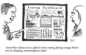
5. Bells and whistles: presumably in order to give salesmen something to wow prospective customers, M&T software commonly employs gratuitous animation, 3-D effects, superfluous colour and tricksy elements like speedometer dials. Ridiculously cluttered ‘dashboards’ are the order of the day.
Tip: please, please read Stephen Few’s book “Information dashboard design”
Current details of my courses and masterclasses on monitoring and targeting can be found here
