In energy-intensive manufacturing processes there is a need to benchmark production units against each other and against yardstick figures. Conventional wisdom has it that you should compare specific energy ratios (SER), of which kWh per gross tonne is one common example. It seems simple and obvious but, as anybody will know who has tried it, it does not really work because a simple SER varies with output, and this clouds the picture.
To illustrate the problem and to suggest a solution, this article picks some of the highlights from a pilot exercise to benchmark air compressors. These are the perfect thing for the purpose not least because they are universally used and obey fairly straightforward physical laws. Furthermore, because they are all making a similar product from the same raw material, they should in principle be highly comparable with each other.
Various conventions are used for expressing compressors’ SERs but I will use kWh per cubic metre of free air. From the literature on the subject you might expect a given compressor’s SER to fall in the range 0.09 to 0.14 kWh/m3 (typically). Lower SER values are taken to represent better performance.
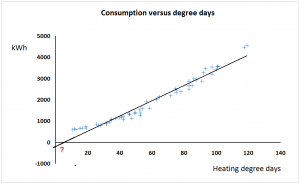
The drawback of the SER approach is that some compressor installations, like any energy-intensive process, have a certain fixed standing load independent of output. The compressor installation in Figure 1 has a standing load of 161 kWh per day for example, and this has a distorting effect: if you divide kWh by output at an output of 9,000 m3 you should find the SER is just under 0.12 kWh/m3 but at a low daily output, say 4,000 m3 , you get 0.14 kWh/m3. The fixed consumption makes performance look more variable than it really is and changes in throughput change the SER whereas in reality, with a small number of obvious exceptions, the performance of this particular compressor looks quite consistent.
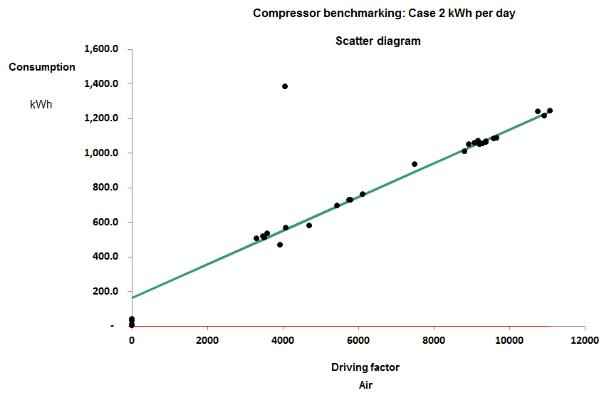
Figure 1
When I say it looks consistent I mean that consumption has a consistent straight-line relationship with output. The gradient of the best-fit straight line does not change across the normal operating range: it is said to be a ‘parameter’. In parametric benchmarking we compare compressors’ marginal SERs, that is, the gradients of their energy-versus-output scatter diagrams. The other parameter that we might be interested in is the standing load, i.e., where the diagonal characteristic crosses the vertical (kWh) axis.
The compressor installation in Figure 1 is one of eight that I compared in a pilot study whose results were as follows:
============================
Case   Marginal  Standing
No     SER       kWh per day
----------------------------
 8      0.085       115
 5      0.090        62
 1      0.092     3,062
 2      0.097       161
 7      0.105        58
 6      0.124        79
 3      0.161       698
============================
As you can see, the marginal SERs are mainly fairly comparable and may prove to be more so once we have taken proper account of inlet temperatures and delivery pressures. But their standing kWh per day are wildly different. It makes little sense to try comparing the standing loads. In part they are a function of the scale of the installation (Case 1 is huge) but also the metering may be such that unrelated constant-ish loads are contributing to the total. The variation in energy with variation in output is the key comparator.
In order to conduct this kind of analysis, one needs frequent meter readings, and the installations in the pilot study were analysed using either daily or weekly figures (although some participants provided minute-by-minute records). Rich data like this can be filtered using cusum analysis to identify inconsistencies, so for example in Case 3, although there is no space to go into the specific here, we found that performance tended to change dramatically from time to time and the marginal SER quoted in the table is the best that was consistently achieved.
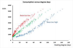
Case 7 was found to toggle between two different characteristics depending on its loading: see Figure 2. At higher outputs its marginal SER rose to 0.134 kWh/m3, reflecting the relatively worse performance of the compressors brought into service to match higher loads.
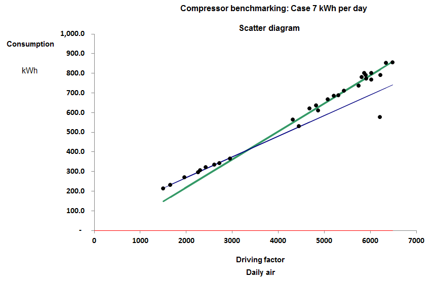
Figure 2
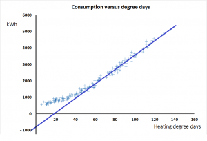
In Case 8, meanwhile, the compressor plant changed performance abruptly at the start of June, 2016. Figure 3 compares performance in May with that on working days in June and we obtained the following explanation. The plant consists of three compressors. No.1 is a 37 kW variable-speed machine which takes the lead while Nos 2 and 3 are identical fixed-speed machines also of 37 kW rating. Normally, No.2 takes the load when demand is high but during June they had to use No.3 instead and the result was a fixed additional consumption of 130 kWh per day. The only plausible explanation is that No. 3 leaks 63 m3 per day before the meter, quite possibly internally because of defective seals or non-return vales. Enquiries with the owner revealed that they had indeed been skimping on maintenance and they have now had a quote to have the machines overhauled with an efficiency guarantee.
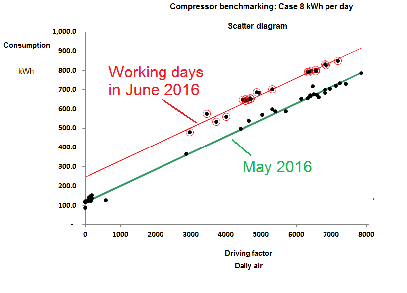 Figure 3
This last case is one of three where we found variations in performance through time on a given installation and were able to isolate the period of best performance. It improves a benchmarking exercise if one can focus on best achievable, rather than average, performance; this is impossible with the traditional SER approach, as is the elimination of rogue data. Nearly all the pilot cases were found to include clear outliers which would have contaminated a simple SER.
Deliberately excluding fixed overhead consumption from the analysis has two significant benefits:
- It enables us to compare installations of vastly differing sizes, and
- it means we can tolerate unrelated equipment sharing the meter as long as its contribution to demand is reasonably constant.
 The UK’s first energy manager was Oliver Lyle, managing director of the eponymous sugar refinery in London. He was successful not only because he was in a position of influence but also because he was a very capable engineer. Fuel efficiency was mission critical to him both during the war (because of rationing) and afterwards when the effect of rationing was compounded by economic growth.