Is this the worst energy dashboard ever?
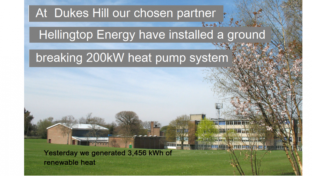
It’s an anonymised but accurate reconstruction of something I recently saw touted as an example of a ‘visual energy display’ suitable for a reception area. Apart from patently being an advertisement for an equipment supplier — name changed to protect the innocent (guilty?) — the only numerical information in the display is in small type against a background which makes it hard to read. Also, one might ask, “so what?”. There is no context. What proportion was 3.456 kWh? What were we aiming for? What is the trend?
There’s a bigger picture here: in energy reporting generally, system suppliers have descended into “content-lite” bling warfare (why do bar charts now have to bounce into view with a flourish?). And nearly always the displays are just passive and uncritical statements of quantities consumed. Anybody who wants to display energy information graphically should read Stephen Few’s book Information Dashboard Design . It is clear that almost no suppliers of energy monitoring systems have ever done so, but perhaps if their customers did, and became more discerning and demanding, we might see more useful information and less meaningless noise and clutter.