A recent issue of the CIBSE Journal, which one would have thought ought to have high editorial standards, recently published an article which was basically a puff piece for a certain boiler water additive. It contained some fairly odd assertions, such as that the water in the system would heat up faster but somehow cool down more slowly. Leaving aside the fact that large systems in fact operate at steady water temperatures, this would be magic indeed. The author suggested that the additive reduced the insulating effect of steam bubbles on the heat-exchanger surface, and thus improved heat transfer. He may have been taking the word ‘boiler’ too literally because of course steam bubbles don’t normally occur in a low or medium-temperature hot water boiler, and if they did, I defy him to explain how they would interfere with heat transfer in the heat emitters.
But for me the best bit was a chart relating to an evaluation of the product in situ. A scatter diagram compared the before-and-after relationships between fuel consumption and degree days (a proxy for heating load). This is good: it is the sort of analysis one might expect to see,
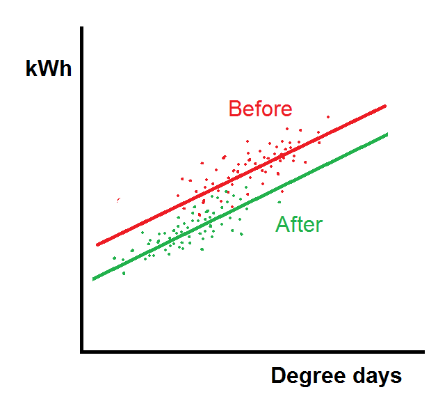 The chart looked like this, and I can’t argue that performance is better after than before. The problem is that this chart does not tell quite the story they wanted. The claim for the additive is that it improves heat transfer; the reduction in fuel consumption should therefore be proportional to load, and the ‘after’ line ought really to have a shallower gradient as well as a lower intercept. If the intercept reduces but the gradient stays the same, as happened here, it is because some fixed load (such as boiler standing losses) has disappeared. One cannot help wondering whether they had idle boilers in circuit before the system was dosed, but not afterwards.
The analysis illustrated here is among the useful techniques people learn on my energy monitoring and targeting courses.