Category Archives: Energy analysis and reporting

Discounted cash flow

HOW SHOULD energy-saving investment opportunities be evaluated? I recommend discounted cash-flow (DCF) rather than the commonplace, but somewhat crude, metric of simple payback period. DCF will give you two measures of a project’s value:

  1. Internal rate of return (IRR) is the rate of interest you’d need to get from investing your cash in something else, to make that the more profitable choice; and
  2. Net present value (NPV) shows you what lump sum today would equal the lifetime profit from the project, assuming that you place relatively less weight on future savings the further off they are.

To carry out a DCF calculation for an energy-saving project you start with year-by-year estimates of costs and savings. In the simplest model there is a single cost item in the first year and equal annual savings thereafter; but with some projects there will be costs in future years, or the savings may be predicted to vary in future. The screenshot below shows an annotated example in an Excel spreadsheet. It evaluates a heat-recovery system which, as well as an up-front investment cost, will incur annual electricity costs and maintenance charges (all outgoings being shown in red):

The IRR in this example is 54.7%.

The NPV depends on what you choose as a ‘test rate of discount’. In theory this would be the interest you pay on borrowings, although in practice it is often set a lot higher as a hedge against perceived risk. The example above uses 16% and you can see in row F the discount factors that result. In Year 3 the factor is 0.641, meaning that the savings of £31,332 expected that year are only worth £20,073 in today’s terms.  In aggregate the NPV is £91,444. That’s how much better off you would be than the option of doing nothing.

Note that with a lower test rate of discount, the discount factors in row F increase, which raises the net present value.


A DCF workbook is available to download here. It includes the annotated example shown above, a live calculation that you can use for experimentation and familiarisation, and an unlocked version which you can copy and adapt.


‘Average’ and ‘Standard’ degree day figures

EFFECTIVE MANAGEMENT AND ANALYSIS of buildings’ energy consumptions for heating or cooling calls for summary data about how cold or hot the weather has been. Weekly or monthly degree-day statistics provide that information in a convenient manner. But as well as the current values (against which your weekly or monthly energy consumption can be gauged), in the United Kingdom[1] we have two kinds of long-term aggregate value that can be useful for other purposes.

Standard degree-day values

For normalising consumptions we need degree-day values for a ‘reference year’, which allow actual consumptions for buildings in different locations (and possibly measured at different times) to be adjusted back to a comparable basis. Historically, the UK government recommended a standard value of 2,463 heating degree days (to base 15.5C). The source of this number is unknown; it is, in effect, arbitrary but for the purpose of weather-adjustment it does not matter what the number is. This single point of reference was later developed into the following table providing corresponding reference values for different base temperatures, for cooling as well as heating, and disaggregated to individual months:

|     |        Heating       |       Cooling        |
|Month| 18.5'C 15.5'C 10.0'C | 15.5'C 5.0'C -20.0'C |
|     |                      |                      |
| Jan |    488    395    226 |      0    17     705 |
| Feb |    426    342    189 |      0    23     652 |
| Mar |    390    297    134 |      0    64     803 |
| Apr |    319    233     96 |      5   114     837 |
| May |    235    151     39 |     14   192     963 |
| Jun |    148     77      9 |     26   265    1015 |
| Jul |     88     42      4 |     96   380    1155 |
| Aug |    100     45      5 |     57   338    1113 |
| Sep |    162     83     10 |     14   245     995 |
| Oct |    268    177     48 |      1   158     925 |
| Nov |    359    275    124 |      0    53     719 |
| Dec |    439    346    176 |      0    29     755 |
|     |                      |                      | 
|Total|  3,422  2,463  1,060 |    213 1,878  10,637 |

Table 1: standard degree day values

It is important to appreciate that these standard values are fixed and not related to any particular geographical area.

Average degree-day values

If we are forecasting consumption we need to know what future degree-day values we can expect month by month. For this purpose we use 20-year average degree-day values. So the expected degree-day value for next February (for example) is the average of the last 20 Februaries. You can download the UK regional average figures via this link.

In contrast to ‘standard’ degree-day values, ‘average’ values differ from region to region and tend to vary with time thanks to the changing climate. I usually update the table once a year.

[1] Subject to the availability of suitable historical data, the same principles could be applied in other regions.

Multiple driving factors: netting back

Suppose you want to analyse the relationship between consumption and its most significant driving factor, but you know that there is a secondary influence which will distort the result if you don’t take account of it. The easy way to approach this is to analyse historical data statistically using multiple regression, which will estimate the fixed consumption and give you the sensitivities to both variable driving factors.

Unfortunately, in a world where you cannot guarantee that the thing you are analysing has previously behaved in a consistent manner, this statistically-derived guess at the relationship could well be wrong. It will also be unreliable if, for example, the secondary driving factor does not vary very much.

We must bear in mind that statistical analysis has no insight into physical reality and can therefore generate implausible answers. Because of this, I always recommend using non-statistical methods of establishing how consumption responds to variation in a given driving factor. One way is to go back to first principles. Daylight-linked lighting demand provides an excellent example. If you have, say, 500 watts capacity of photocell-controlled lighting, you know for sure that it will use 0.5 kWh for each hour of darkness. Weekly and monthly hours of darkness (HD) can be obtained from standard tables and thus, for any given week or month, you can say how much electricity that lighting installation will use: it’s just 0.5 x HD. What we can do now is ‘net back’ our historical energy consumptions by deducting 0.5 x HD from the metered totals. This removes a calculated allowance for external lighting and the net consumption can then legitimately be analysed against the primary driving factor alone.

Netting-back can be used in other circumstances. On one occasion I was trying to model expected electricity consumption for cooling a computer data centre. Obviously cooling degree days are one driving factor here, but cooling demand would also be sensitive to the amount of electricity fed to the computers housed in the building (for every kWh consumed in the equipment racks, some fraction of a kWh is needed to provide the corresponding cooling). If the rack power were constant week by week, it would not be a problem, as the consequent cooling requirement would appear as part of the fixed electricity demand. On the other hand if it varied widely from week to week it would not be a problem either, because regression analysis would then have a fighting chance. The difficulty was that rack power did vary, but not very often and usually not by very much. The practical solution here was to assume a coefficient of performance for the chillers and to say that their demand would vary by 0.3 kWh per kWh of electricity delivered to equipment racks. Although this was more of an educated guess than an actual measurement, any error in the estimated coefficient was very much diluted in the overall expected-consumption model and on balance the model was more accurate than it would have been if the factor were ignored.

Want training on energy monitoring and targeting? Check the listings at http://vesma.com/training

A case history

I’ll conclude with a story where regression analysis was problematic and a netting-back approach had to be used.

The story concerns an all-electric building which at the outset I had not yet visited, but for which I had energy data. Since no heating fuel was involved, I started by analysing electricity consumption against heating degree days only, which yielded the result shown in Figure 1. Consumption is predominantly fixed:

Figure 1: consumption relative to heating degree days

The gradient of the line, at 1.4 kWh/HDD, was troublingly low. Finding that the building had reversible heat pumps I concluded that I was looking at the combined overlapping effect of seasonal heating and cooling.

As there was good information on the thermal performance of the building I was able to estimate what the gradient of the line should have been in theory. It came out at 5.8 kWh/HDD. This enabled me to net back the historical totals to get figures for non-heating consumption, which, when analysed against cooling degree days, gave me Figure 2:

Figure 2: non-heating consumption relative to cooling degree days

The gradient of the cooling relationship came out at 3.5 kWh/CDD.

Out of interest I also subjected the data to multiple regression analysis. This yielded an estimate of fixed consumption similar to the other methods but underestimated the coefficients of the two driving factors. It gave a heating degree-day coefficient of 3.6 kWh/HDD (compared with 5.8 based on the building’s physical characteristics) and a cooling coefficient of 1.8 kWh/CDD compared with the 3.5 derived above. It is always problematic when heating and cooling degree days both apply as driving factors, because they are not the completely independent variables that statistical theory demands.

Summary

‘Netting back’ is a useful strategy when consumption has two or more driving factors and you do not want to rely entirely on regression analysis. It is particularly useful when

  • You have a good method of determining a coefficient from first principles, or empirically from a deliberate test;
  • You have a known driving factor which varies only slightly or changes infrequently;
  • You have driving factors that are not completely independent

Monitoring all-electric retail stores

This article concerns a retail chain in the UK whose stores are a mix of gas-heated and all-electric buildings, any of which could also be using air conditioning to some extent. Their analysts had the task of defining expected-consumption formulae based on historical consumption and degree-day data. The question was what driving factors they should choose: heating degree days, cooling degree days, or both?

For any store with a gas supply, the answer was reasonably obvious: we could expect gas consumption to depend on heating degree days. Furthermore, electricity in those cases was likely either to be driven by cooling degree days or to be weather-insensitive.

For all-electric stores in general the picture is less clear but the likelihood had to be that heating was the main driver in these cases. This was based on the fact that they were more likely than not to behave like their gas-heated counterparts. So my advice was to treat heating degree days as the primary factor driving week-by-week variation in consumption. After that the only question to answer was whether there was any cooling influence, and that can be answered quickly by looking at the consumption profile through the year. Three scenarios are likely:

1. Higher consumption in winter only. This suggests there is no cooling influence;


2. Higher consumption in winter and summer than in spring and autumn. This clearly indicates a cooling load;


3. Broadly constant consumption all year. This also implies a cooling load.


Why does scenario 3, which shows no seasonal changes, imply the presence of cooling load? Precisely because higher winter consumption is not evident. These buildings must in fact be using heating, but they must also have a seasonal demand for cooling which overlaps the heating season, and adding the two together creates the flat profile.

Worst league table format ever?

The chart format on the left is a reconstruction of something I saw in an energy reporting system based on a generic platform who shall remain nameless (you know who you are). It is being used here to represent the relative total energy consumptions of a number of establishments. Although admittedly it is better than a pie chart, it is still one of the least user-friendly designs I have ever seen. The person who devised it should be ashamed of themselves.

Why have remote labels with a colour-coded key, when the labels could just be put alongside the bars they relate to as shown on the right-hand example? Especially as with so many entries the colours are hard to discriminate even for a user with perfect colour vision.

The right-hand version of the chart gives the identical information perfectly clearly with bars of the same colour, the additional advantage being that, if required, one specific item can be highlighted in a contrasting shade as shown. Oh, and it won’t matter if your computer monitor’s colour rendering is a bit off.

Project profile: training and support for software developer

My client here was an energy management bureau allied to a facilities maintenance company. They’re working for a retail chain with several hundred UK sites and they needed to develop not just useful energy reports for their customer’s regional managers, but also an effective method of detecting and prioritising exceptional adverse performance, so that avoidable energy waste can be spotted and remedied in a cost-effective manner.

Working on software code with the developer

We did the training in two parts, both via Zoom video link. On the Tuesday we went through the key generic principles using a pared-back version of my one-day training course on monitoring and targeting. Then on the Friday, after they’d had a chance to experiment with some data on an Excel-based toolkit, we got to grips with the software platform that they use. The screenshot shows me working with their managing director and software developer to build some of the key functionality that they will require.

SECR in a nutshell

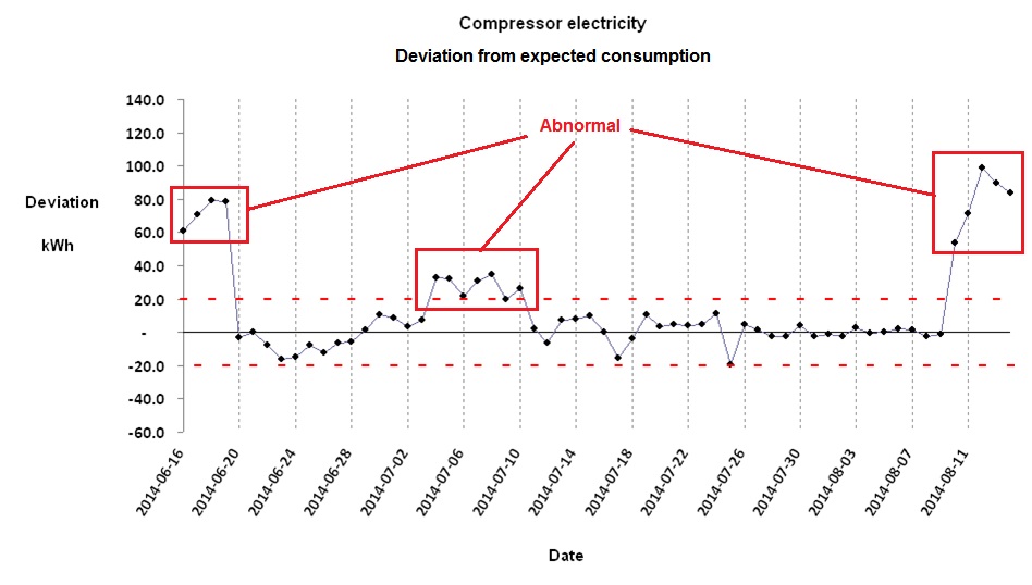
Updated 30/4/21 and 4//4/22

“Streamlined energy and carbon reporting” (SECR) is the term commonly used to describe the regime introduced with the Companies (Directors’ Report) and Limited Liability Partnerships (Energy and Carbon Report) Regulations 2018, Statutory Instrument 1155. This is not a self-contained set of regulations like ESOS; instead it consists of nothing but dozens of amendments to existing company reporting law. In short, undertakings covered by SECR simply need to collate annual total energy and emissions data and give them to their company secretary or accountant for inclusion in the annual report that they already have to prepare.

As this is an extension of financial reporting, compliance will be policed by the Financial Reporting Council, and not, as one might have thought, by the Environment Agency. The good news is that in terms of accuracy and completeness, your SECR reports need only be free of material misstatements, and according to the Government’s published guidance it is fine for a company to omit 2-5% of its energy or emissions if it considers them not to be material in the grand scheme of things.

Who is affected?

SECR applies to all quoted companies, and to unquoted companies and limited liability partnerships (LLP) which meet two of the following three criteria:

  1. At least 250 employees;
  2. £36 million annual turnover or more
  3. Balance sheet of £18 million or more

This is not quite the same as the ESOS regulations, in which an undertaking would be obliged to participate if it met criterion (1) alone.

Undertakings which consumed less than 40,000 kWh in the year being reported do not have to report their actual figures but must still state that they fell below that threshold.

It is fine for a company to omit 2-5% of its energy or emissions if it considers them not to be material

Group reports should include the figures for all subsidiaries apart from those that would be exempt. Under these circumstances a subsidiary need not report its own figures although, of course, it will still need to collate the data for group use.

What must be reported?

The requirement covers energy use and greenhouse gas emissions arising from all use of electricity, gas, and transport fuels. Incidentally the definition of “gas” is not limited to natural gas, but refers to any gaseous fuel so it even includes hydrogen. The inclusion of electricity on an equal footing with other energy sources means that SECR differs from emissions reporting, in which fuels and pirchased electricity are considered under different ‘scopes’. Somewhat bizarrely liquid and solid fuels do not have to be accounted for, unlike in CRC (which SECR supposedly replaces) ESOS and EUETS. Bought-in heat, steam and cooling are included but not compressed air.

Quoted companies must report global figures, but LLPs and unquoted companies only have to declare UK consumption and emissions.

In the main, therefore, any undertaking that already keeps even very basic monthly fuel and electricity consumption records for its fixed assets will have no trouble collating the necessary energy data. Transport fuel, of course, is a different issue. As many an ESOS participant has found, transport fuel data are disproportionately hard to collect relative to its importance in the mix. Luckily, if you can reasonably assert that your transport energy and emissions are not material to the overall picture, you can just leave them out.

My advice would therefore be to look first at transport fuels, decide whether they are material, and if so put resources into capturing the data or estimating the figures.

SECR requires emissions to be reported as well as energy consumptions. The necessary factors are published by the government and undertakings would be well advised to set up a methodical procedure for carrying out the calculations, because they must include details of their methodology alongside the data that they report.

Undertakings must report intensity metrics, of which an example would be kWh per unit of saleable product output. The idea is that stakeholders will be able to see, once a year, what progress the company is making in energy efficiency. This is actually a somewhat naïve and fanciful aim, given all the ways that such simple ratios can be distorted by external factors nothing to do with energy performance. Even more implausible is the idea of making ‘benchmarking’ comparisons between enterprises, but that is the government’s stated objective.

Companies are entitled not to report intensity metrics if, in their opinion, it would be prejudicial to their interests to do so. For example it might entail disclosing sensitive information about their sales volume. One option is to quote a metric based on financial turnover (which is already disclosed anyway). This may not be meaningful, but then neither is anything else they might report.

Finally, annual reports must now include descriptions of the principal measures taken to improve energy efficiency during the year in question, if there were any.

What is the compliance deadline?

Energy, emissions, intensity metrics and associated methodologies must be stated in annual reports covering accounting years starting in April 2019 or later, so by now all companies will have had full reporting years covered by the scheme (the last wave was for reporting years ending in February 2021). Actual report submission deadlines fall six months later for public companies, nine for private companies.


See links to SECR resources

Control charts in energy performance monitoring

Once you have discovered how to routinely calculate expected consumptions for comparison with actual recorded values, you can get some very useful insights into the energy behaviour of the processes, buildings and vehicles under your supervision. One thing you can do is chart the history of how actual and expected consumption compare. In this example we are looking at the daily electricity consumption of a large air-compressor installation:

Comparison of actual daily consumptions with what they should have been given the output of the compressors

The green trace represents expected kWh (computed by a formula based on the daily air output) and the individual points represent the actual metered kWh. Most of the time the two agree, but there were times in this case when they diverged.

It is illuminating to concentrate on the extent to which actual consumption has deviated from expected values, so in the following chart we focus on the difference between them:

The difference between actual and expected consumption.

There will always be some discrepancy between actual and expected consumptions. Part of the difference is purely random, and the limits of this typical background variation are signified by the red dotted lines. If the difference goes outside these bounds, it is probably because of an underlying shift in how the object is performing. In the above diagram there were three episodes (one moderate, two more severe) of abnormal performance. Significant positive deviations (above the upper control limit) are more usual than negative ones because consuming more energy than required for a given output is much more likely than using less.

For training in energy consumption analysis look for ‘monitoring and targeting’ at VESMA.COM

In a well-constructed energy monitoring and targeting scheme, every stream of consumption that has a formula for expected consumption will also have its own control limit. The limits will be narrow where data are reliable, the formula is appropriate, and the monitored object operates in a predictable way. The limits will be wider where it is harder to model expected consumption accurately, and where there is uncertainty in the measurements of consumption or driving factors. However, it is not burdensome to derive specific control limits for every individual consumption stream because there are reliable statistical methods which can largely automate the process.

Control charts are useful as part of an energy awareness-raising programme. It is easy for people to understand that the trace should normally fall between the control limits, and that will be true regardless of the complexity of the underlying calculations. If people see it deviate above the upper limit, they know some energy waste or losses have occurred; so will the person responsible, and he or she will know that everyone else could be aware of it as well. This creates some incentive to resolve the issue, and once it has been sorted out everyone will see the trace come back between the limits.

Demand visualisation with heatmap views

The principle

Widespread adoption of automatic meter reading has given many energy users a huge volume of fine-grained data about energy consumption. How best to use it? A ‘heat-map’ chart is a powerful visualisation technique that can easily show ten weeks’ half-hourly data in a single screen. This for example is the pattern of a building’s gas consumption between November and January:

Each vertical slice of the chart is one day, running midnight to midnight top to bottom, with each half-hourly cell colour-coded according to demand . This creates a contour-map effect and when you look at this specifi example, you can see numerous features:

  • Fixed ‘off’ time;
  • Optimised startup time (starts later when the building has not cooled down as much overnight);
  • Peak output during startup;
  • Off at weekends but with some heating early on Saturday mornings;
  • Shut-down over Christmas and New Year; and
  • A brief burst of consumption during the Christmas break, presumably frost protection.

Further examples

This building’s gas consumption pattern is quite similar to the previous one’s (they both belong to the same organisation), but the early-morning startup boost is much more evident and occurs even during the Christmas and New Year break:

Next we have a fairly typical profile for electricity consumption in an office building. What is slightly questionable is the higher daytime consumption near the start (April) compared with the end (June). This suggests the use of portable heaters. Note also that the peak half-hourly demands can easily be seen (Friday of the second week and Wednesday of the fiifth week). In both cases it is evident that those peaks occurred not because of any specific incident but because consumption had generally been higher than usual all day:

In this final example we are looking at short-term heatmap views of electricity feeding a set of independent batch processes in a pharmaceutical plant. The left-hand diagram is the actual measured consumption while the right-hand diagram is the expected profile based on a mathematical model of the plant into which we had put information about machine scheduling:


Energy targeting for humidity-control systems

The amount of moisture in the atmosphere varies through the year because the amount of water vapour that the air can hold is temperature-dependent. We human beings are sensitive to the relative humidity (RH), which is the ratio between the actual moisture content and the maximum that the air could hold at its prevailing temperature: generally, we don’t feel uncomfortable if the RH is between 30% and 70%. Problems will obviously occur in very hot, humid weather (when the RH will be high) but they can also occur in the depths of winter. This is because, if you take some cold outside air and heat it up for use in your building, its relative humidity falls as the temperature increases without the addition of any moisture. In an air-conditioned building, hot outside air is chilled to the comfort temperature, and the RH rises. Suppose that you want to maintain 20°C inside, with RH in the range 40% and 60%. If the ambient air contains less than 0.006 kg of water vapour per kg of dry air (regardless of its temperature), it will need humidifying; but should it exceed 0.009, moisture will need to be removed. The demand for moisture addition or removal will be proportional to the deficit or surplus in the mixing ratio. For example, ambient air at 0.013 kg/kg needs twice as much dehumdification as air at 0.011 kg/kg (0.013-0.009 is double 0.011-0.009).

Figures 1 and 2 show typical weekly histories of moisture deficit and excess for a site in Ireland. Notice how the demand is seasonal, with warmer summer air able to hold more moisture.

Figure 1
Figure 2

How does this affect energy demand? Well, to dehumidify air you need to chill it to its saturation temperature at the required moisture content. Excess moisture condenses out, and the partially dried air is then reheated to take it back to the required target temperature. This where the extra energy demand comes from.

You can see the difference between cooling-only and full air conditioning in figures 3 and 4. Figure 3 shows a case where the relationship between chiller electricity and cooling degree days is evidently a straight line: this building has no humidity control and chiller demand is effectively driven only by the outside dry-bulb temperature.

Figure 3

Figure 4, by contrast, is curved; this building has humidity control. The curve occurs because as the weather gets hotter, the amount of moisture in the air increases, and with it the demand for dehumidification.

Figure 4

Figure 5 shows the deviation from expected consumption that results when one tries to model electricity demand with the single straight-line relationship of figure 4 in which predicted consumption is

23,151 kWh per week, plus
162 kWh per cooling degree day
Figure 5

The model can be improved by accounting for the dehumidification demand: Figure 6 shows the history of deviations when a two-factor model is used, in which predicted consumption is

24,259 kWh per week, plus
107 kWh per cooling degree day, plus
16.4 kWh per unit of dehumidification demand
Figure 6

The reduced error in the calculation of expected electricity consumption makes overspend alerts more reliable and the monitoring and targeting scheme more effective.

To implement this scheme one needs local dry-bulb and relative humidity readings at frequent intervals, which are used to calculate the ambient mixing ratio. Two running totals are then kept: one of the accumulated atmospheric moisture deficit, and one of the accumulated excess. The procedure is not unlike the “accumulated temperature deficit” which is used in the calculation of heating degree days.


For details of training courses in energy management visit vesma.com/training