Once you have discovered how to routinely calculate expected consumptions for comparison with actual recorded values, you can get some very useful insights into the energy behaviour of the processes, buildings and vehicles under your supervision. One thing you can do is chart the history of how actual and expected consumption compare. In this example we are looking at the daily electricity consumption of a large air-compressor installation:
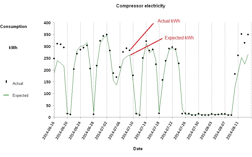
The green trace represents expected kWh (computed by a formula based on the daily air output) and the individual points represent the actual metered kWh. Most of the time the two agree, but there were times in this case when they diverged.
It is illuminating to concentrate on the extent to which actual consumption has deviated from expected values, so in the following chart we focus on the difference between them:
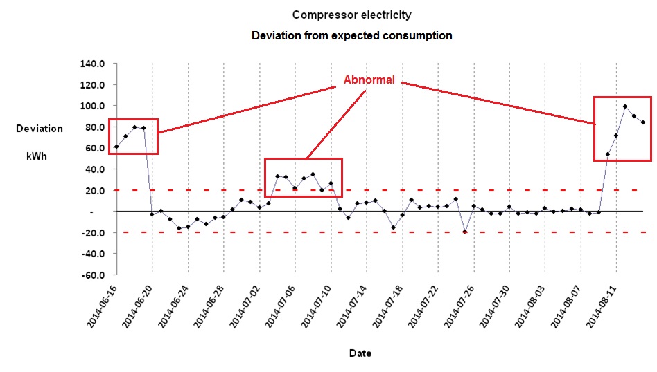
There will always be some discrepancy between actual and expected consumptions. Part of the difference is purely random, and the limits of this typical background variation are signified by the red dotted lines. If the difference goes outside these bounds, it is probably because of an underlying shift in how the object is performing. In the above diagram there were three episodes (one moderate, two more severe) of abnormal performance. Significant positive deviations (above the upper control limit) are more usual than negative ones because consuming more energy than required for a given output is much more likely than using less.
For training in energy consumption analysis look for ‘monitoring and targeting’ at VESMA.COM
In a well-constructed energy monitoring and targeting scheme, every stream of consumption that has a formula for expected consumption will also have its own control limit. The limits will be narrow where data are reliable, the formula is appropriate, and the monitored object operates in a predictable way. The limits will be wider where it is harder to model expected consumption accurately, and where there is uncertainty in the measurements of consumption or driving factors. However, it is not burdensome to derive specific control limits for every individual consumption stream because there are reliable statistical methods which can largely automate the process.
Control charts are useful as part of an energy awareness-raising programme. It is easy for people to understand that the trace should normally fall between the control limits, and that will be true regardless of the complexity of the underlying calculations. If people see it deviate above the upper limit, they know some energy waste or losses have occurred; so will the person responsible, and he or she will know that everyone else could be aware of it as well. This creates some incentive to resolve the issue, and once it has been sorted out everyone will see the trace come back between the limits.