The principle
Widespread adoption of automatic meter reading has given many energy users a huge volume of fine-grained data about energy consumption. How best to use it? A ‘heat-map’ chart is a powerful visualisation technique that can easily show ten weeks’ half-hourly data in a single screen. This for example is the pattern of a building’s gas consumption between November and January:
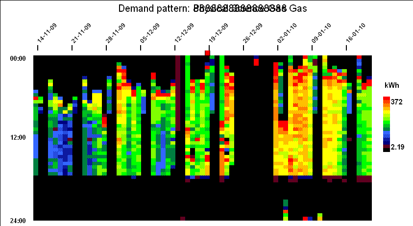
Each vertical slice of the chart is one day, running midnight to midnight top to bottom, with each half-hourly cell colour-coded according to demand . This creates a contour-map effect and when you look at this specifi example, you can see numerous features:
- Fixed ‘off’ time;
- Optimised startup time (starts later when the building has not cooled down as much overnight);
- Peak output during startup;
- Off at weekends but with some heating early on Saturday mornings;
- Shut-down over Christmas and New Year; and
- A brief burst of consumption during the Christmas break, presumably frost protection.
Further examples
This building’s gas consumption pattern is quite similar to the previous one’s (they both belong to the same organisation), but the early-morning startup boost is much more evident and occurs even during the Christmas and New Year break: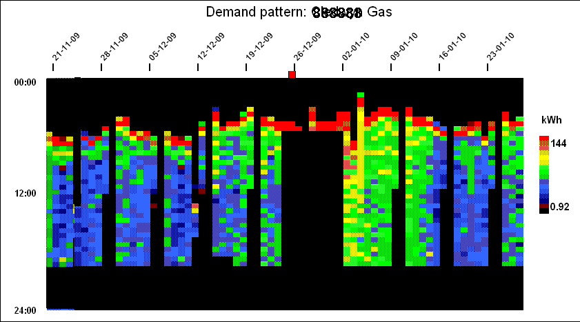
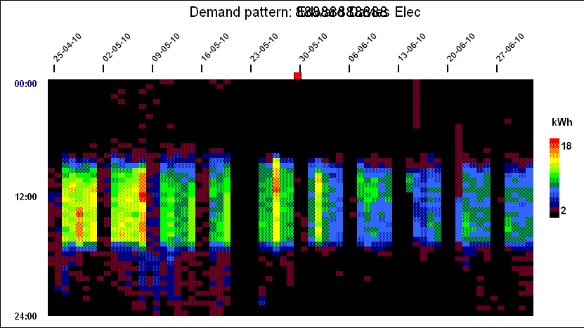
Next we have a fairly typical profile for electricity consumption in an office building. What is slightly questionable is the higher daytime consumption near the start (April) compared with the end (June). This suggests the use of portable heaters. Note also that the peak half-hourly demands can easily be seen (Friday of the second week and Wednesday of the fiifth week). In both cases it is evident that those peaks occurred not because of any specific incident but because consumption had generally been higher than usual all day:
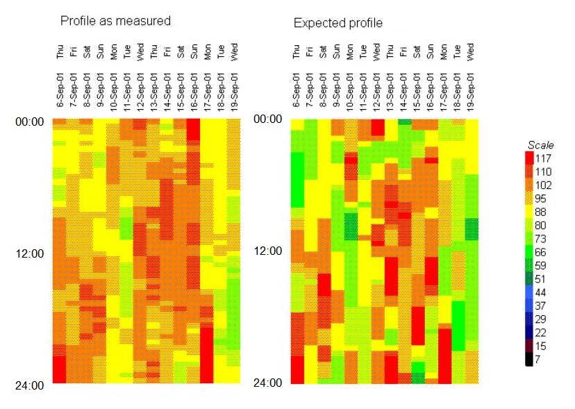
In this final example we are looking at short-term heatmap views of electricity feeding a set of independent batch processes in a pharmaceutical plant. The left-hand diagram is the actual measured consumption while the right-hand diagram is the expected profile based on a mathematical model of the plant into which we had put information about machine scheduling: