All posts by Editor

Heat meters using ultrasonic flow measurement

Clamp-on ultrasonic flow meters are tricky things to deploy and I always get a sinking feeling when somebody says they’re going to use them. In this case they were fitted to measure cooling energy as part of a measurement and verification project.  Provisional analysis in the early weeks of the project showed that all was not well: there were big apparent swings in performance, which were unrelated to what we knew was going on on the plant.

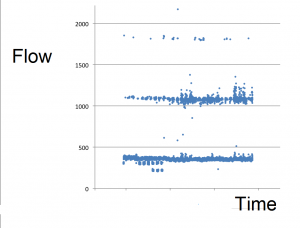
Data from the meters, which were downloaded at one-minute intervals, contained computed kWh values which I was consolidating into hourly totals. The person sending me the data was extracting the kWh figures into a spreadsheet for me but some instinct prompted me to request the raw data, which I noticed contained the flow and temperature readings as well as the kWh results. My colleague Daniel wrote a fast conversion routine which saved our friend the trouble and we discovered that there were occasional huge spikes in the one-minute kWh records which were caused by errors in the volumetric flow rates. The following crude diagram of the minute-by minute flows over several weeks shows that as well as plausible results (under 500 cubic metres per hour) there were families of high readings spaced at multiples of about 750 above that:

The discrepancies were sporadic, rare, and clearly delineated so Dan was able to modify his software to skip the anomalous readings and average over the gaps. We were lucky that flow rates and temperatures were relatively constant, meaning that the loss of an occasional minute per hour was not fatal. He also discovered that the heat meter was zeroing out low readings below a certain threshold, and he plugged those holes by using the flow and differential-temperature data to compute the values which the meter had declined to output.

The next diagram shows the relationship between the meter’s kWh output, aggregated to eight-hourly intervals (on the vertical axis) with what we believe to be the true readings (on the horizontal axis). The straight line represents a 1:1 relationship and shows that, quite apart from the gross discrepancies, readings were anomalously high in almost every eight-hour interval.
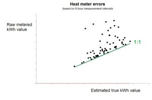
Relationship between raw eight-hourly kWh and the estimated true values

The effect on our analysis was dramatic. Instead of erratic changes in performance not synchronised with the energy-saving measure being turned on and off, we were able to see clear confirmation that it was having the required effect.
 

Sankey diagram software

Sankey diagrams depict the flows of energy through a system or enterprise using arrows whose widths are proportional to the magnitudes of the flows.

My friend and former colleague Kevin Cardall recently challenged my newsletter readers to come up with improvements on an Excel-based Sankey Diagram generator which he had devised (illustrated right, and attached here). His work was inspired by this website. Reader David B. responded rapidly with a neat enhancement but we also had a number of alternatives suggested by other readers.

Readers’ recommendations

When the subject of Sankey diagram software came up in 2003 one of my clients recommended SDRAW.  It is a commercial product but there is a free demonstration version.

Readers Colin G., Gary C. and Chris S. mentioned a free online tool, http://sankeymatic.com/ and reader Andy drew my attention to this toolkit for those who want to do it in Excel.


Product guidance

The Government’s Energy Technology List (ETL) is a highly recommended resource. The ETL was devised to complement the Enhanced Capital Allowances scheme (a meagre tax concession for installing energy-efficient equipment) but it is useful in its own right because products cannot get onto the list without rigorous scrutiny from expert assessors. This makes it useful for filtering out bogus products.

Of course not every manufacturer, supplier or product that could be on the list is necessarily there. But the ETL itself, which lists products, is complemented by an Energy Technology Criteria List which lays down the criteria for inclusion within each product category. This will help you establish what to look for if you are doing your own evaluation of unlisted products (or if you just want to know what attributes are important, or what performance thresholds separate good products from the rest).

The ETL website has recently been revamped and can be accessed at https://etl.beis.gov.uk/.

“Energy Service Company in a Box”

ESCO in a box is a concept being developed with government support with the aim of improving takeup of energy-saving measures among small and medium enterprises.

In essence, the project is designed to enable respected local community organisations (for example) to set up as providers of energy-saving services to the SMEs in their area, by equipping them with a complete package of technical, analytical, legal and financial components.

The originators of the idea, EnergyPro Ltd, have produced an  overview of the scheme  and I interviewed their managing partner, Steven Fawkes, about it on 15 April. The recording will be available until 14 May at http://bit.ly/ESCObox  (apologies that the recording is missing the first couple of minutes).

Software-defined electricity

DATELINE 1 APRIL, 2020:  Some readers will remember the so-called ‘signature meter’ that was marketed ten or so years ago. This was a kWh meter which could reportedly discriminate between over 83 different connected electrical appliances being turned on and off. It did not take off at the time but thanks to the current transition from big data to immense data (ID) the concept has returned in the guise of ‘software-defined electricity’.

With software-defined electricity your power supply waveform would be sampled more than 37 times a microsecond, processed in the cloud and dynamically corrected to remove spikes, holes and resonant ramps so that connected equipment uses less energy, runs cooler, and enjoys extended life. Phase-shifting arrays (similar to those used in multi-antenna 5G beam-forming transmitters) will allow a parallel-wired power conditioner to target individual loads on a customer’s premises so that they operate as an internet-of-things (IoT), each at its own unique current and frequency, thereby running cooler and enjoying extended life.

With people increasingly working from home, it even allows their additional energy expenditure to be monitored and charged back to their employer. In effect, every connected device will act as its own microgrid with blockchain technology embedded in the optimisation algorithm to give near-real-time trading and market reconciliation up to the seventh harmonic, using less energy, running cooler and enjoying extended life. Exciting stuff and all thanks to the Immense-Data Internet of Things (IDIoT).

Energy targeting for humidity-control systems

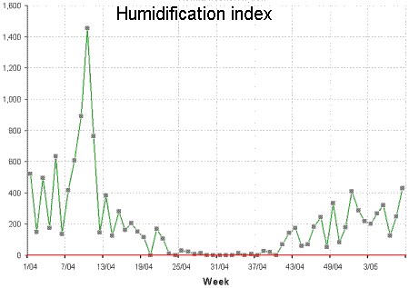
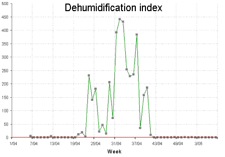
The amount of moisture in the atmosphere varies through the year because the amount of water vapour that the air can hold is temperature-dependent. We human beings are sensitive to the relative humidity (RH), which is the ratio between the actual moisture content and the maximum that the air could hold at its prevailing temperature: generally, we don’t feel uncomfortable if the RH is between 30% and 70%. Problems will obviously occur in very hot, humid weather (when the RH will be high) but they can also occur in the depths of winter. This is because, if you take some cold outside air and heat it up for use in your building, its relative humidity falls as the temperature increases without the addition of any moisture. In an air-conditioned building, hot outside air is chilled to the comfort temperature, and the RH rises. Suppose that you want to maintain 20°C inside, with RH in the range 40% and 60%. If the ambient air contains less than 0.006 kg of water vapour per kg of dry air (regardless of its temperature), it will need humidifying; but should it exceed 0.009, moisture will need to be removed. The demand for moisture addition or removal will be proportional to the deficit or surplus in the mixing ratio. For example, ambient air at 0.013 kg/kg needs twice as much dehumdification as air at 0.011 kg/kg (0.013-0.009 is double 0.011-0.009).

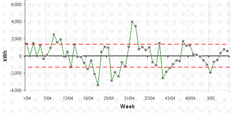
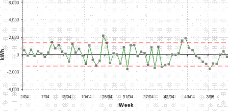
Figures 1 and 2 show typical weekly histories of moisture deficit and excess for a site in Ireland. Notice how the demand is seasonal, with warmer summer air able to hold more moisture.

Figure 1
Figure 2

How does this affect energy demand? Well, to dehumidify air you need to chill it to its saturation temperature at the required moisture content. Excess moisture condenses out, and the partially dried air is then reheated to take it back to the required target temperature. This where the extra energy demand comes from.

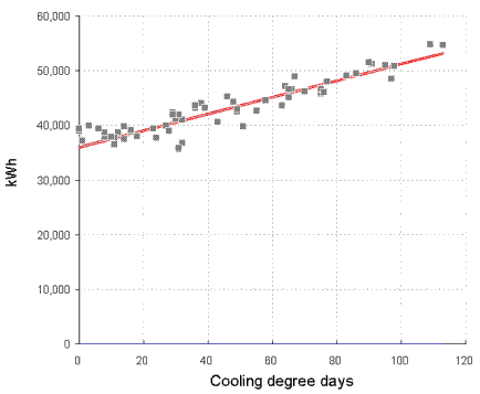
You can see the difference between cooling-only and full air conditioning in figures 3 and 4. Figure 3 shows a case where the relationship between chiller electricity and cooling degree days is evidently a straight line: this building has no humidity control and chiller demand is effectively driven only by the outside dry-bulb temperature.

Figure 3

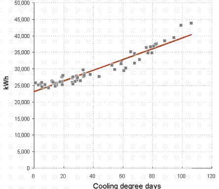
Figure 4, by contrast, is curved; this building has humidity control. The curve occurs because as the weather gets hotter, the amount of moisture in the air increases, and with it the demand for dehumidification.

Figure 4

Figure 5 shows the deviation from expected consumption that results when one tries to model electricity demand with the single straight-line relationship of figure 4 in which predicted consumption is

23,151 kWh per week, plus
162 kWh per cooling degree day
Figure 5

The model can be improved by accounting for the dehumidification demand: Figure 6 shows the history of deviations when a two-factor model is used, in which predicted consumption is

24,259 kWh per week, plus
107 kWh per cooling degree day, plus
16.4 kWh per unit of dehumidification demand
Figure 6

The reduced error in the calculation of expected electricity consumption makes overspend alerts more reliable and the monitoring and targeting scheme more effective.

To implement this scheme one needs local dry-bulb and relative humidity readings at frequent intervals, which are used to calculate the ambient mixing ratio. Two running totals are then kept: one of the accumulated atmospheric moisture deficit, and one of the accumulated excess. The procedure is not unlike the “accumulated temperature deficit” which is used in the calculation of heating degree days.


For details of training courses in energy management visit vesma.com/training

Monitoring vehicle performance

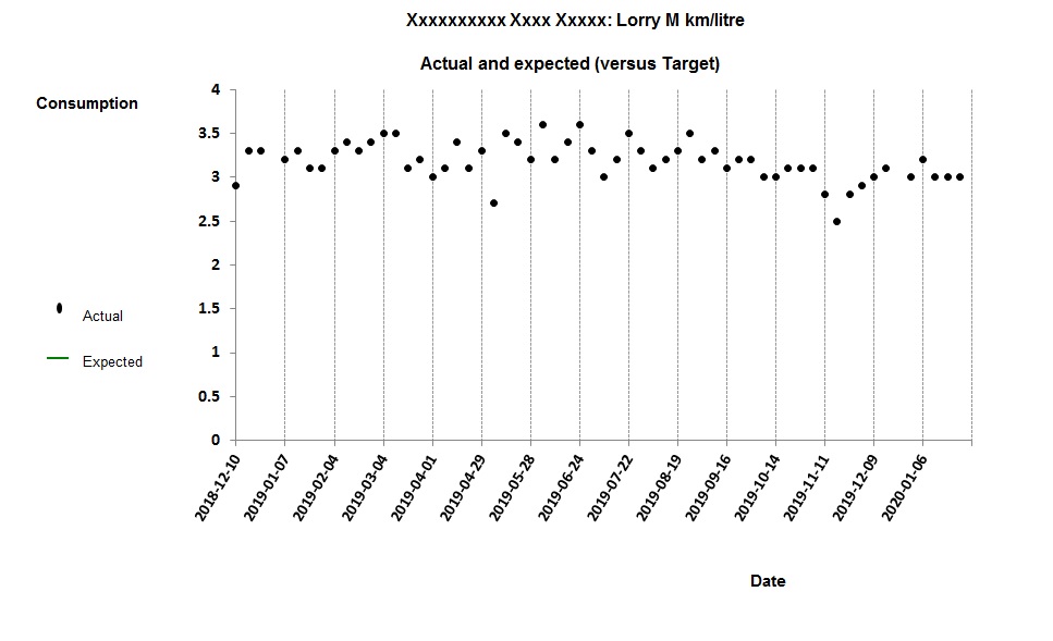
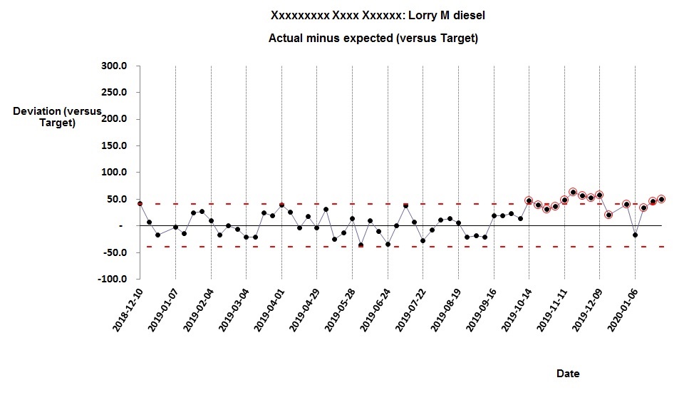
Normally when we track vehicle performance we think in terms of miles per gallon or kilometres per litre. So in figure 1 for example we are looking at the weekly km/litre figure for a 32-tonne flatbed lorry delivering building materials:

Figure 1: trend in kilometres per litre

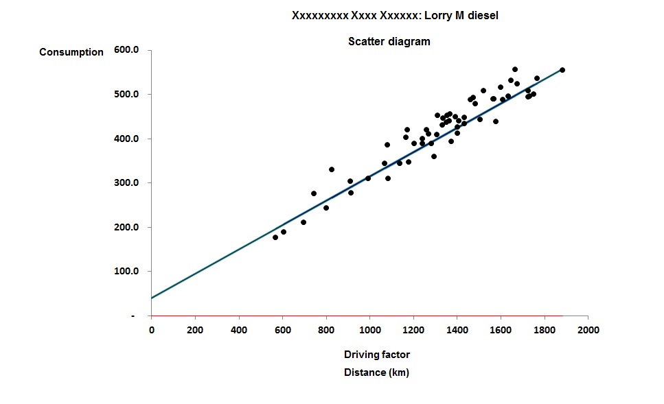
It is just about possible to discern worsening performance towards the end of the trace. But by taking a slightly different approach we can not only confirm that there is an issue, but also learn more about its timing, nature and magnitude. We should start by plotting weekly fuel consumption against weekly distance traveled as in Figure 2. (Distance traveled is the “driving factor” in this analysis not in the sense of driving the lorry, but in the sense that variation in weekly distance traveled “drives” variation in weekly fuel use):

Figure 2: relationship between weekly fuel consumption and distance driven

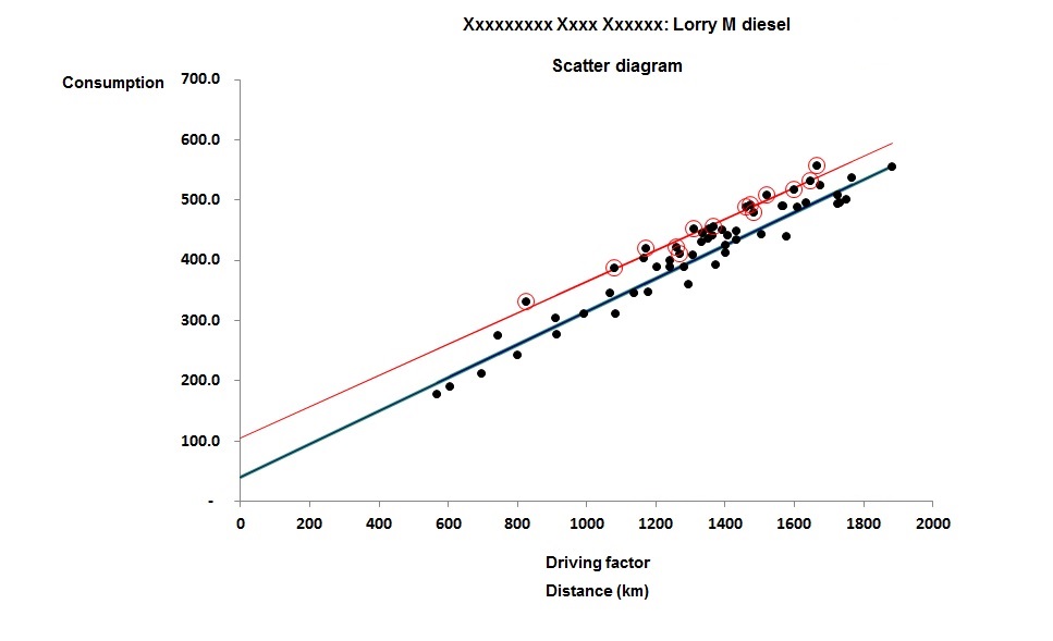
What we see is that there is an element of consumption (about 40 litres per week in this case) that is unrelated to distance driven. Most likely, this is fuel consumed while stationary. The straight-line relationship gives us a more precise gauge of performance because it allows us to deduce expected consumption each week quite accurately. We can thus show the deviation from expected fuel consumption as a time-history chart (Figure 3):

Figure 3: weekly deviation from expected fuel consumption

From this it is clear that there was a change in behaviour on or about 7 October, which manifests itself as a fairly consistent 50-litre-per week excess almost every week since (see the highlighted points).

Furthermore, we can compare the adverse and achievable behaviour on the scatter diagram (Figure 4) in which the post-change points are marked:

Figure 4: comparison of behaviour before and after the change

The red straight line is a best fit through all the post-change points, and it shows us that the apparent excess fuel consumption is not distance-related. It might be a permanent change in terrain or traffic conditions or a new pattern of deliveries with more waiting time…  Or it might be a new driver who doesn’t turn their engine off while waiting. It probably isn’t a mechanical fault, because that would tend to change the gradient of the line. But at least we know when the change occurred (which will help trace the cause), its nature (which helps eliminate some kinds of fault) and its magnitude (which helps us decide whether to bother pursuing the case).

Try getting those insights from tracking the MPG.

This method of monitoring energy performance also applies to buildings and industrial processes, and you can find training on the method at http://vesma.com/training

Tracking performance of light vehicles

Here is a monitoring challenge: suppose you want to do a weekly check on the performance of a small fleet of hotel minibuses. Although you can record the mileage at the end of each week, you will have a lot of error in your fuel measurement because you’ll only know how much fuel was purchased but not when. How can you adjust for the inconsistent fuel tank level at the end of the week?

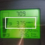
One method would be to use the trip computer display which will show the estimated remaining miles (see picture). The vehicle in question has a 45-litre tank: at its typical achieved average mpg, it has a range of 613 miles of which it has used 39%, so we can add 45 x 0.39 = 18 litres to our calculated fuel consumption. Note that we will need to deduct an equal amount from next week’s consumption, and this “carry forward” is likely to reduce the error in the adjustment.

This procedure also helps if drivers do not consistently fill to the top. To the extent that they underfill on the last occasion in the week, the shortfall will increase the adjustment volume to compensate. The adjustment can only ever be approximate, however, so it’s better if they consistently brim the tank.

The other advice I would give is to track not miles per gallon (or any similar performance ratio) but to plot a regression line of fuel versus distance. This will pick up, and detect changes in, idling behaviour.

Monitoring electrically heated and cooled buildings

WHEN you use metered fuel  to heat a building (or indeed if you use the building’s electricity supply, but have no air-conditioning) it is straightforward to monitor heating performance critically because you can relate energy consumption to the weather expressed as degree days.

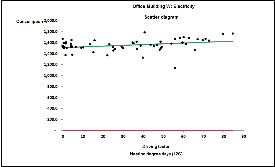
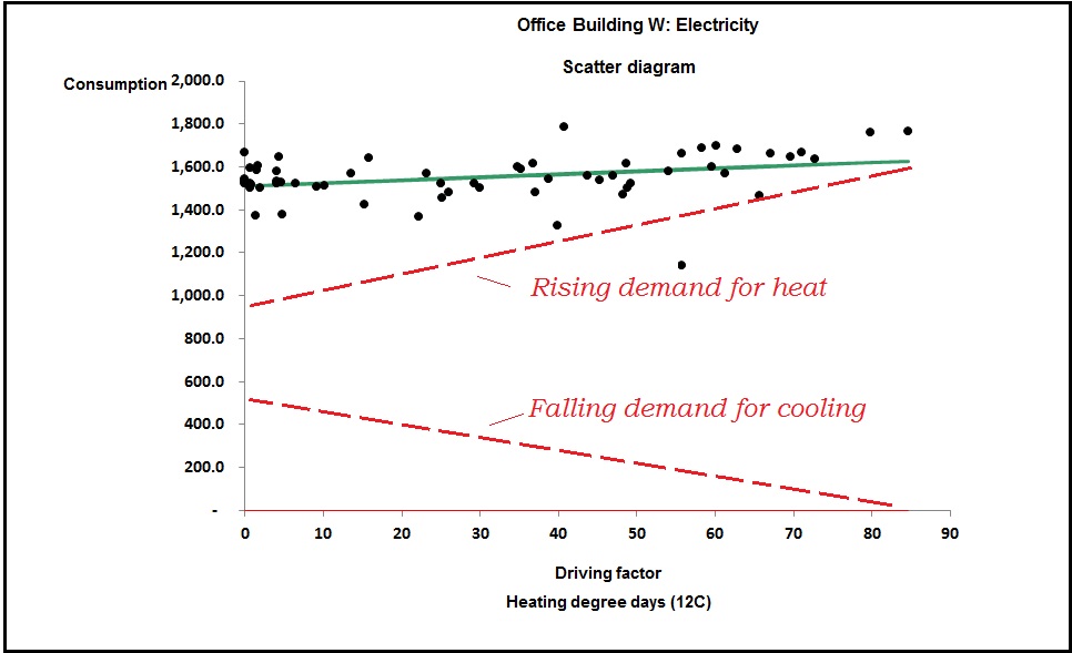
Things get difficult if you use electricity for both heating and cooling and everything shares a meter, as would be the case if you use reversible heat pumps (air-source or otherwise). Because the seasonal variations in demand for heating and cooling complement each other (one being high when the other is low), you may encounter cases where the sum of the two appears almost constant every week. Such was the case on this 800-m2 office building:

Figure 1: apparent low sensitivity to weather


Without going into detail, this relationship implied a heating capacity of little over 1 kW, which is obvious nonsense as there was no other source of heat. The picture had to be caused by overlapping and complementary seasonal demands for heating and cooling, which is illustrated conceptually in Figure 2:

Figure 2: total consumption is the sum of heating and cooling demands


The challenge was how to discover the gradients of the hidden heating and cooling lines. The answer in this case lay in the fact that we had sufficient information to estimate the building’s heat rate, which is the net heat flow from the building in watts per unit inside-outside temperature difference (W/K). The heat rate depends on the thermal conductivity of the building envelope and the rate at which outside air enters. There is a formula for the heat rate Q:

Q = Σ(UA) + NV/3

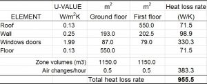
Where U and A are the U-values and superficial areas of each building element (roof, wall, window, etc), V is the volume of the building and N is the number of air changes per hour. Figure 3 shows the spreadsheet in which Q was calculated for the building in question (an on-line tool to do this job is available at vesma.com):

Figure 3: calculation of heat rate

In this case the building measurements were taken from drawings, the U-values were found on the building’s Energy Performance Certificate (EPC), and the figure of 0.5 air changes per hour is just a guess.

The resulting heat rate of 955.5 W/K equates to 955.5 x 24 / 1000  = 22.9 kWh per degree day. This is heat loss from the building but it uses a heat pump and will therefore require less input electricity by a factor of, in this case, 3.77 (that being the coefficient of performance cited on its EPC).  So the input energy required for heating this building is 22.9 / 3.77 = 6.1 kWh per degree day. This is the gradient of the unknown heating characteristic, the upper dotted line in Figure 2.

Need training in energy management? Have a look at vesma.com

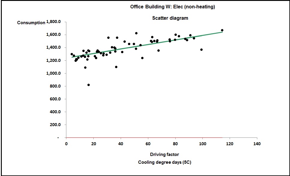
To work out the sensitivity to cooling demand we use a little trick. We take the actual consumption history and deduct an allowance for heating load which, in each week, will be 6.1 times the number of heating degree days (remember we just worked out the building needed 6.1 kWh per degree day for heating). This non-heating electricity demand can now be analysed against cooling degree days and this was the result in this case:

Figure 4: variation of non-heating electricity with cooling degree days


The gradient of this line is 3.5 kWh per (cooling) degree day. It is of similar order to the 6.1 kWh per degree day for heating, which is to be expected; the building’s heat loss and gain rates per degree difference are likely to be similar. As importantly, we now have an intercept on the vertical axis (a shade over 1,200 kWh per week) which represents the non-weather-related demand. Taking Figure 1 at face value we would have erroneously put the fixed consumption at around 1,500 kWh per week.

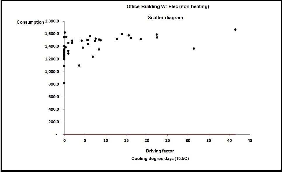
Also significant is the fact that Figure 4 was plotted against cooling degree days to a base of only 5°C. That was the only way to get a rational straight line and it means there is a finite amount of cooling going on at outside temperatures down to that value. I had been assured that cooling was only enabled “when the weather got hot”. But plotting demand against cooling degree days to, say, 15.5°C (a common default for summer-only use) gave the result shown in Figure 5:

Figure 5: non-heating electricity demand against cooling degree days to a base of 15.5C


This is not as good a correlation as Figure 4 and my conclusion in this case was that when the outside temperature is between 5 and 12°C, this building is likely to have some rooms heating and some cooling.

Carbon emissions – a case of rubbish data and wrong assumptions

The UK Government provides tables for greenhouse gas emissions including generic figures for road vehicles. For example a rigid diesel goods vehicle of 7.5 to 17 tonnes has an indicative figure of 0.601 kg CO2e per km. You need to apply such generic figures with caution, though. I saw a report from a local council that used that particular number to back-calculate emissions from its refuse collection trucks. Leaving aside the fact that many of their vehicles are 26 tonners, they spend much of their time accelerating, braking to a halt, idling and running hydraulic accessories, with the result that one would expect them to do no better than about 4 mpg with emissions more like 1.8 kg CO2e per km, three times the council’s assumed value.

For the council in question that is not a trivial error. Even on their optimistic analysis domestic waste collection represents 33% of their total emissions. Properly calculated (ideally from actual fuel purchases) they will turn out to be more than all their other emissions taken together.

Further reading

Training

For sustainability professionals to make a real practical difference to carbon emissions they need a broad appreciation of technical energy-saving opportunities. To help them understand the potential more clearly I run a one-day course called ‘Energy Efficiency A to Z‘. Details of this can be found at http://vesma.com/training