The amount of moisture in the atmosphere varies through the year because the amount of water vapour that the air can hold is temperature-dependent. We human beings are sensitive to the relative humidity (RH), which is the ratio between the actual moisture content and the maximum that the air could hold at its prevailing temperature: generally, we don’t feel uncomfortable if the RH is between 30% and 70%. Problems will obviously occur in very hot, humid weather (when the RH will be high) but they can also occur in the depths of winter. This is because, if you take some cold outside air and heat it up for use in your building, its relative humidity falls as the temperature increases without the addition of any moisture. In an air-conditioned building, hot outside air is chilled to the comfort temperature, and the RH rises. Suppose that you want to maintain 20°C inside, with RH in the range 40% and 60%. If the ambient air contains less than 0.006 kg of water vapour per kg of dry air (regardless of its temperature), it will need humidifying; but should it exceed 0.009, moisture will need to be removed. The demand for moisture addition or removal will be proportional to the deficit or surplus in the mixing ratio. For example, ambient air at 0.013 kg/kg needs twice as much dehumdification as air at 0.011 kg/kg (0.013-0.009 is double 0.011-0.009).
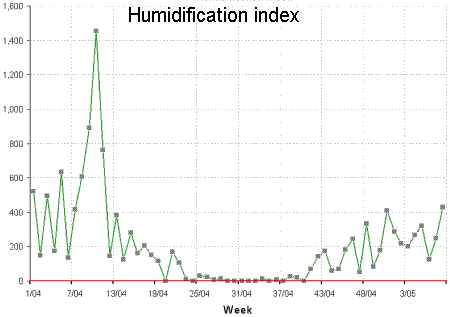
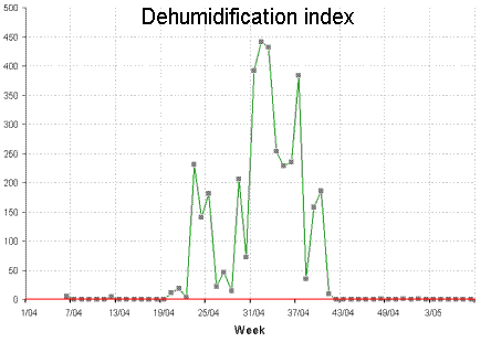
Figures 1 and 2 show typical weekly histories of moisture deficit and excess for a site in Ireland. Notice how the demand is seasonal, with warmer summer air able to hold more moisture.
How does this affect energy demand? Well, to dehumidify air you need to chill it to its saturation temperature at the required moisture content. Excess moisture condenses out, and the partially dried air is then reheated to take it back to the required target temperature. This where the extra energy demand comes from.
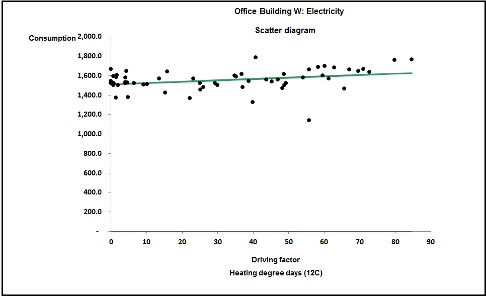
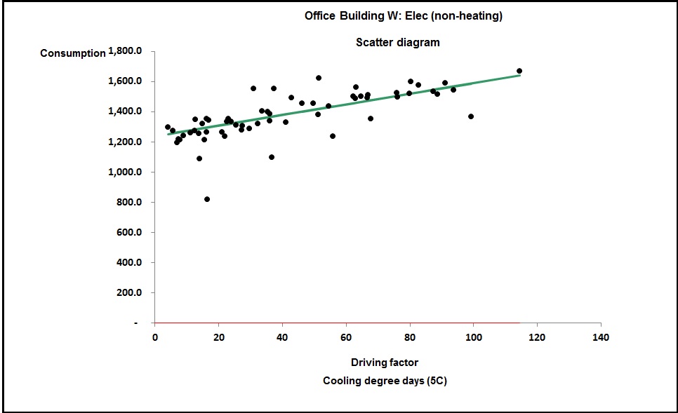
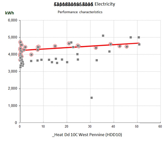
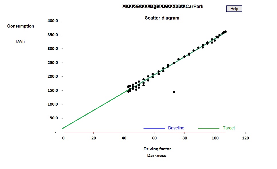
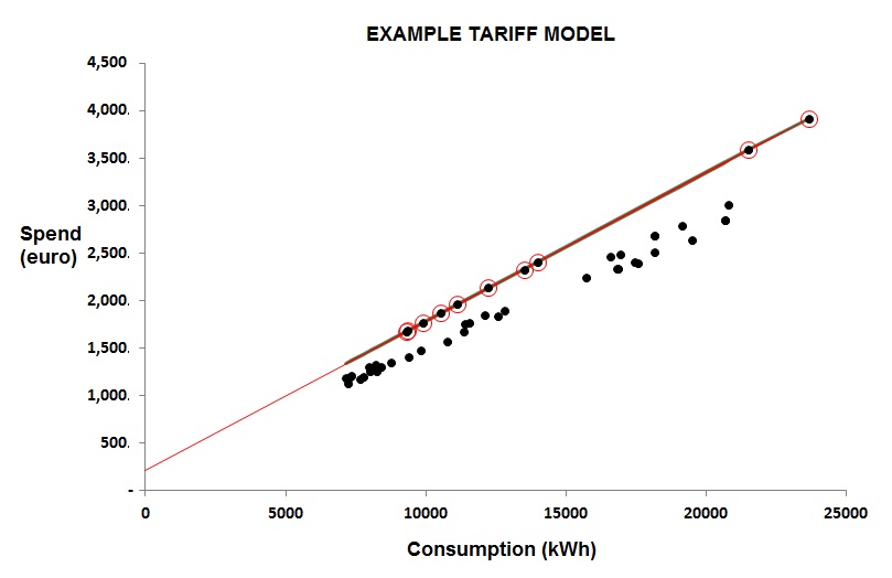
You can see the difference between cooling-only and full air conditioning in figures 3 and 4. Figure 3 shows a case where the relationship between chiller electricity and cooling degree days is evidently a straight line: this building has no humidity control and chiller demand is effectively driven only by the outside dry-bulb temperature.
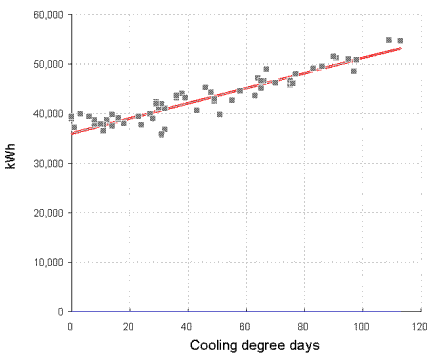
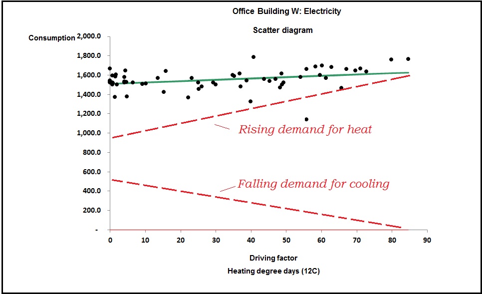
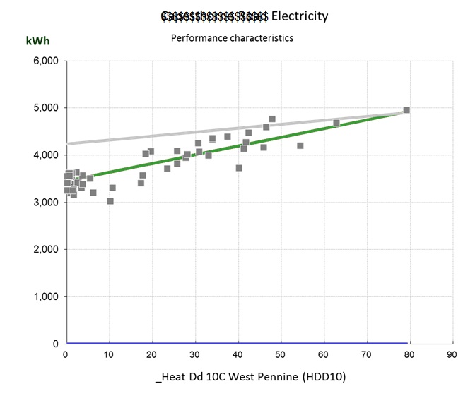
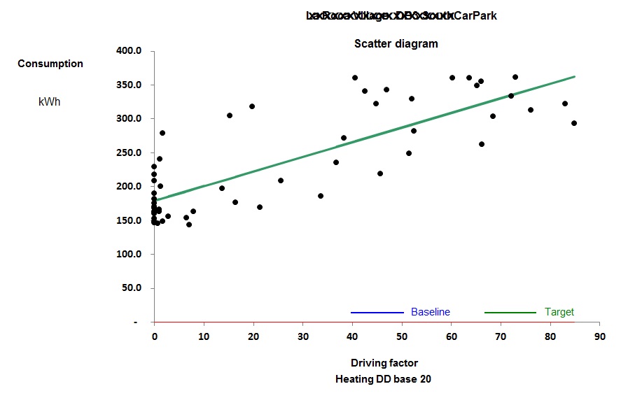
Figure 4, by contrast, is curved; this building has humidity control. The curve occurs because as the weather gets hotter, the amount of moisture in the air increases, and with it the demand for dehumidification.
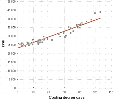
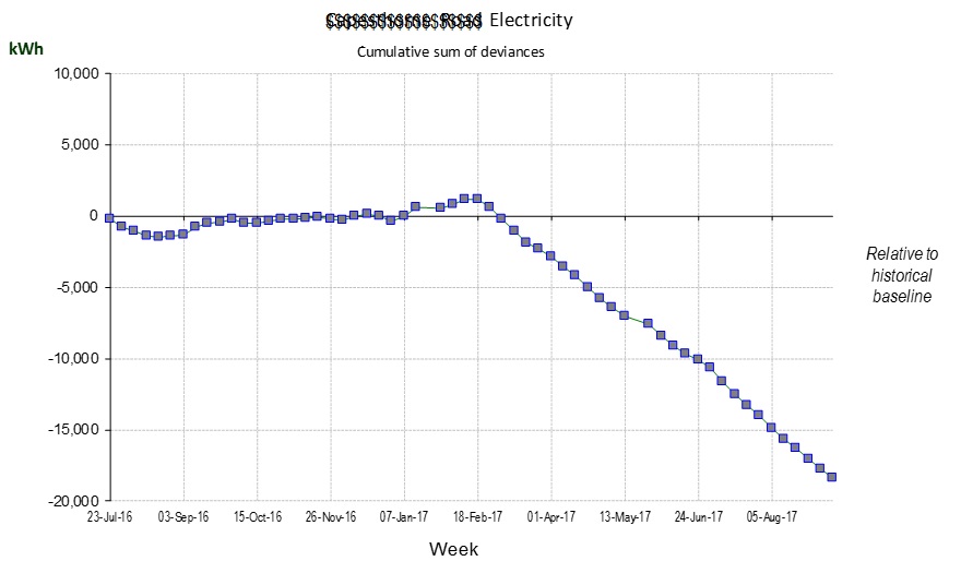
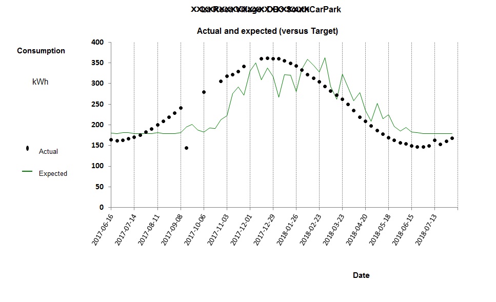
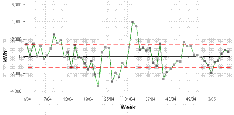
Figure 5 shows the deviation from expected consumption that results when one tries to model electricity demand with the single straight-line relationship of figure 4 in which predicted consumption is
23,151 kWh per week, plus
162 kWh per cooling degree day
The model can be improved by accounting for the dehumidification demand: Figure 6 shows the history of deviations when a two-factor model is used, in which predicted consumption is
24,259 kWh per week, plus
107 kWh per cooling degree day, plus
16.4 kWh per unit of dehumidification demand
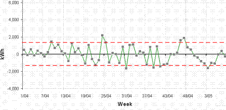
The reduced error in the calculation of expected electricity consumption makes overspend alerts more reliable and the monitoring and targeting scheme more effective.
To implement this scheme one needs local dry-bulb and relative humidity readings at frequent intervals, which are used to calculate the ambient mixing ratio. Two running totals are then kept: one of the accumulated atmospheric moisture deficit, and one of the accumulated excess. The procedure is not unlike the “accumulated temperature deficit” which is used in the calculation of heating degree days.
For details of training courses in energy management visit vesma.com/training