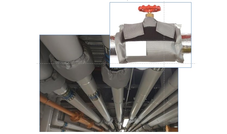
MISSING insulation on hot pipework is not just a waste of energy and money. It can cause overheating of the space it occupies, may compromise delivery temperatures, and may even constitute a scalding hazard.
Allowable heat losses are stipulated in British Standard 5422, which lays down the requirements for compliance with building services compliance guides.
VESMA.COM provides a free on-line calculator which enables you to check whether a given thickness of a particular insulant is likely to be adequate.
STOP PRESS we are running a two-hour technical briefing on pipe, tank and duct insulation presented by Chris Ridge of the Thermal Insulation Contractors’ Association on 7 April, 2022. Details here.
THE ANALYSIS TECHNIQUES that underpin energy monitoring and targeting have important applications in the search for energy-saving opportunities. A good energy audit doesn’t start with a checklist and a clipboard: it starts with some desktop analysis. Here’s how…
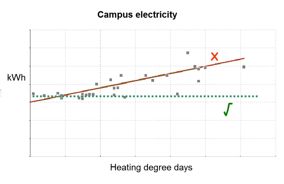
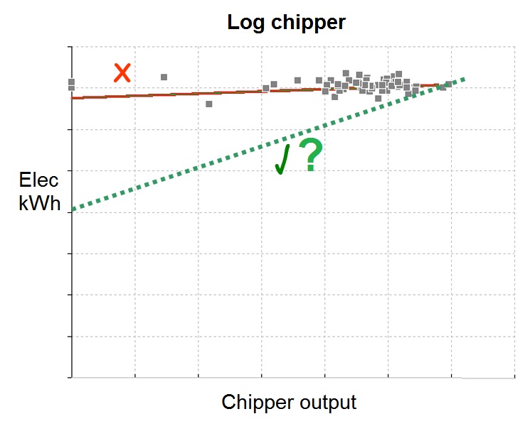
Regression analysis, in which we establish the historical relationship between consumption and its driving factor(s), can give us clues if we see anomalous patterns. Does consumption appear to be weather-related when it shouldn’t be, as in Figure 1? Does it fail to respond to production throughput (as in Figure 2) when logically it ought to vary? Do we seem to have unreasonable levels of fixed consumption?
Figure 1: electricity consumption on this campus was strongly weather related even though it had gas-fired main heating. The relationship should have been a horizontal line rather than sloping. Students were using portable electric heaters in their roomsFigure 2: electricity consumption on this log-chipper did not fall with lower throughput as one might expect. The machine had high losses and was running continuously although logs were being fed through only occasionally
Regression analysis also enables ‘parametric’ benchmarking which is a simple but more effective variation on the theme (see separate article).
Cusum analysis meanwhile shows us whether past performance has been consistent, and if not, when it changed plus (when combined with regression analysis) in what manner. Did we add (or lose) some fixed demand? Or did sensitivity to a driving factor change? (Read more about cusum here).
Next, the concept of expected consumption enables the computation of ‘performance deficit’, meaning the absolute quantity of energy that we are using in excess of achievable minimum requirements. When translated into cost terms this gives us a clear view of where our most valuable opportunities lie (read more about performance deficit here).
Last week I attended a thought-provoking presentation on digital twinning (DT) by the energy manager at Glasgow University, which has built digital twins for five of its buildings. It’s not a topic I know much about but I was interested because, going by what it says on the tin, it sounded like potentially a good tool for what I would call ‘discrepancy detection’ as a way of saving energy. In other words, spotting when a real building’s behaviour deviates from what it should be doing under prevailing circumstances, which will nearly always incur a penalty in excess energy consumption. The other potential benefit of DT to my mind would be the ability to try alternative control strategies on the virtual building to see if they yielded savings, and what adverse impacts there might be on service levels. This would be less intrusive than the default tactic of experimenting on live occupants.
Unfortunately I came away with the impression that we are still a way off achieving these aims. The big obstacle seems to be that DT is not dynamic – it only provides a static model. That surprised me a lot, and if any readers have evidence to the contrary, please get in touch. Another misgiving (and to be fair, the presenter was very candid about these issues) was the cost and difficulty of building and calibrating a detailed virtual model of a building and its systems. Then there is the question of all the potential influencing factors that you cannot afford to measure.
My conclusions are in two parts. One is that simulating the effect of alternative control strategies would have to be done with software short of a full DT implementation, in other words, using much-simplified dynamic block models. The other is that discrepancy detection is probably still best done with conventional monitoring-and-targeting approaches using data at the consumption-meter level, with expected consumption patterns derived empirically from historical observations rather than from theoretical models.
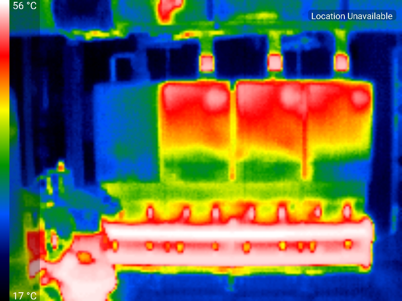
This bank of four boiler modules is operating at part load and infra-red imaging confirms that the left-hand module, which is shut down, is not losing heat to atmosphere thanks to an automatic flue damper which prevents cold air being drawn through it.
The other three modules are sharing a relatively light load by running at low output. This tends to incur less loss than operating one or two units at high fire, because the exhaust temperature is lower at reduced burner output.
Over the years I have trained hundreds of energy managers and consultants in the principles of energy monitoring and targeting. Here’s what some of them said…
Good combination of things I already knew and things that were new to me. Very engaging and I enjoyed the practical aspects and group involvement. – Jordan Harrison
Excellent course with Vilnis Vesma. Provided very useful and key techniques for M&T. Very engaging course as well, with regular exercises. One of the more fun and straightforward course I’ve been on! Thank you Vilnis. – GYE
The content is absolutely up-to-date and relevant to my role as energy expert and manager for the industry. All examples for were taken from practice, making this training even more interesting and trusted. It was not my first contact with deviation and CUSUM analyses. But this training brought me new and fresh perspectives. – JLS
Great course – RC
Great training, very interactive throughout – JW
A comprehensive course, packed full of useful nuggets of information – Tim Dennish
It’s so refreshing to find a lecturer that is firmly anchored to the ‘real’ world – David Parsons
Very useful course with lots of practical applications – Laura Storey
A simple approach to a complex subject! – David Roberts
Imperative knowledge for all energy managers – Levi Wong
The workshop was very worthwhile for someone like me whose business is energy saving products but not familiar with degree day concepts – Len Stevens
Excellent day giving basics of energy management – Bruce Claridge
A comprehensive workshop for people tasked with energy monitoring & targeting – David Enever
I never really understood degree days- and now I do! – Stuart Spencer
Vilnis delivers an enthusiastic seminar on energy metering suitable for professionals in the trade and company energy managers – Chris Steer
A much more useful way to spend £250 than simply paying your energy bill – Philip Wanless
Thought provoking – Ted Bradley
Very laid back and made to feel comfortable, being my first course
The most beneficial 1 day event I have attended
A very useful course with clear and concise information. Essential for any Energy Manager – Jon Farmer
Opened my eyes to the amount of added benefit that can be achieved with Degree Day data – Matthew Arnold
An excellent review of how to make the most of energy data – Gareth Ellis
Great course especially for engineers that use regression & cusum analysis, on a regular basis
I found the degree day training one of the most comprehensive and useful experiences of my career. Essential for anyone who needs to know about energy monitoring & targeting – Paige Hodsman
Vilnis is a polished presenter and makes a dry topic quite interesting + useful. Well done – Ed Farmer
Vilnis has many years of practical experience of energy monitoring & has a passion for sharing his knowledge; very refreshing – Catharine Bull
A well structured, thorough and valuable course ideal for businesses keen to save energy – Haydn Young
An excellent course for any energy manager wanting to make the most of analysing their consumption data in a meaningful way. Presented in plain English and exercises to help you apply your knowledge – Janette Ackroyd
I believe that the knowledge I have gained from the training day will be of great value to my clients and allow me to maintain a longer relationship with them – Laurence Fitch
Vilnis really knows his stuff. Excellent course. Highly recommended for anyone interested in monitoring + managing their energy consumption – Simon Hooper
A very useful and full day’s training on energy management & targeting. Knows his stuff – Nicholas Smyth
A fantastic course full of very useful techniques – Steve Ray
Fantastic, very powerful techniques to analyse consumption patterns – Denis Brennan
Good use of a day’s time and money – Adrian Evans
Within the first hour of the course I was itching to get back to work to put what I was being taught into practice – Adrian Stone
Excellent & very well designed – Jonathon Moffat
A focused, very practical and extremely useful day. Highly recommended – Nancy Higgins
Really targets the essentials – Neil Alcock
Gain more, use less. Fly Vilnis – S. Brown
Found potential savings the very day after attending the course – Stephen Middleton
Very well organised training with excellent presentations. Clear, precise & educational – Julia Clarke
The worked examples gave me ideas for analysis using data that was relevant to my organisation – Neil Fletcher
Enlightening energy analysis – Andrew Heygate-Browne
Excellent, well planned, well paced, inclusive and informative. Most helpful. Thank you – Alan Measures
Excellent course, well worth attending – John Taskas
All staff should attend this course – Mark Harrison
A course which I expected to be boring turned out to be quite interesting – Mick Morris
A very useful and extremely interesting course that was well presented – Robert Benson
Very interesting and thought provoking course – Avis Street
A very structured and well paced training event – Alan Asbury
Made concepts which had previously seemed very technical easy to understand – Charlotte Lythgoe
A teaching on the fundamentals of M&T that makes M&T simple – David Charles
A thorough understanding to the science of efficiencies! – Simon Mansfield
excellent, well balanced course and of practical use – George Zych
A comprehensive interactive course essential for all energy managers in every sector – Neil Bradley
Cusum isn’t the complex, scary thing I thought it was – Rebecca Taylor
Brilliant course- very relaxed delivery with practical examples making the material & subject easy to consume – Dave Belshaw
Has completely changed the way we analyse our projects going forward – David Dunbar
Lots of useful technical information presented at a good pace, and in a very accessible style
An excellent day, very sophisticated and detailed presentation for ‘aficionados’ of energy management – David Bradshaw
A very useful course, I wish I’d done it five years ago – Phill Windson
Excellent day- thanks Vilnis
If energy management is new to you then this is the course for you. It’ll get you on the right track straight away. All you could ever need to know- and more!
Excellent course that presented some very powerful energy saving techniques – Daniel Jones
This will completely revitalise our energy M & T – Donald French
armed with these skills you can tackle targeting with confidence – Gary Cooper
Excellent, knowledgeable presentation of simple but effective principles and techniques – Richard Ansell
Great course to understand the practicalities of energy M & T. – Tom Yearley
For once, a course I can actually put into practice at work – AD
A comprehensive course, well delivered
The course was very good, especially the section on setting targets and making them ‘aggressive but achievable’– AV
A necessary course for anyone handling energy data – looking forward to implementing as much of the content as possible across our properties.
Highly recommend this course for energy professionals or anyone wanting to know to monitor their energy. Excellent trainer, thorough course with practical exercises – Kate Ingham
A very useful and insightful course which has helped me greatly with my work in energy analysis – Grace Sadler
The course was delivered in a relaxed and friendly manner where questions and queries were encouraged which greatly assisted in the understanding of the subject. I would recommend the course to anyone interested in setting up an energy monitoring and targeting scheme – Tim Howard
A fantastic course to increase knowledge and confidence – Vicki Rees
A really helpful course which has enabled me to understand monitoring and targeting further – Alistair Mann
Very convenient location, informal, pleny of opportunities to discuss particular aspects and areas of interest, Fairly simple approach and not over-complicated, allowing everyone to keep pace. Some great take-away technical information. Time well spent. The Vesma.com energy monitoring and targeting training is a must for people new to energy management or those with prior knowledge. Some great and simple techniques to understand and inprove your energy performace, backed up with real world experiences – Peter Bowman
I now understand CUSUM! I felt it was very good at providing an overview and the theory.
Format, pricing and contetnt were all very good. Vilnis added a lot of depth to my understanding. If you are genuinely interested in energy management and making data-informed decisions, Vilnis Vesma will put you on the right track. – DC
I think the penny has finally dropped! – Gwen Kinloch
A very straightforward yet clever way of making sense of mountains of data. – Ben Foster
A great introduction to the fundamental techniques of monitoring and targeting. Highly recommended. – Darren Holman
Most people who understand the physics of heating systems will understand why the claims for energy-saving boiler-water additives ring hollow. But similar products (possibly the same ones with different labels) are now being touted for central chiller systems and it is evident that some users have fallen for them. Time to look at these new claims.
First, as a quick potted revision of the context, I’ll describe an air-cooled chiller with ordinary basic control:
Heat is abstracted from the building by means of a closed loop of chilled water leaving the chiller at a set temperature and returning at a higher, and variable, temperature.
The water boils refrigerant in a heat exchanger called the ‘evaporator’ which operates at a temperature just below the chilled-water set point (the difference, called the approach temperature, is typically 2°C or less).
After compression the refrigerant (now at elevated temperature) passes through an air-cooled heat exchanger called the ‘condenser’ which runs maybe 10-15°C hotter than ambient. Here latent heat is lost from the refrigerant, which condenses back to liquid.
Thermodynamically the key thing is the temperature ‘lift’ in the refrigerant between the evaporator and condenser. As users we are interested in the coefficient of performance (CoP) of the machine, which represents the ratio of cooling power out to electrical power in. The theoretical CoP is given by the formula:
Tc/(Th-Tc)
Where Tc and Th are the absolute refrigerant temperatures in the evaporator (cold) and condenser (hot). Let’s put some numbers on this as an example:
Chilled water set point: say 6°C. This is self-evidently fixed.
Evaporator approach temperature: let’s say 2°C. This is the thing which we might be able to influence by improving heat transfer.
From (1) and (2) above we have an evaporator temperature (Tc) of 6-2=4°C or 277K
Ambient air temperature: let’s go for 35°C
Condenser approach temperature: let’s say 12°C
From (4) and (5) we would have a condenser temperature (Th) of 35+12=47°C or 320K
So our theoretical CoP is
Tc/(Th-Tc) = 277/(320-277) = 6.44
(actual CoPs are always lower but that won’t matter if all we want is a comparison)
Now let’s repeat the calculation with an evaporator approach temperature of 1°C instead of 2°C. This means Tc will go up from 277 to 278K and our new CoP will be:
Tc/(Th-Tc) = 278/(320-278) = 6.62
This is slightly less than a 3% improvement, but even that could well be an exaggeration because it assumes (a) that there was scope to reduce the approach temperature in the first place and (b) that poor heat transfer from the chilled water was the cause. Actually if the chilled water system is clean and properly treated it’s unlikely to be the problem: it’s a closed loop so contaminants won’t be getting in. In fact if the evaporator approach temperature is too high the reason is far more likely to be loss of refrigerant, or unbalanced distribution in the chiller, or oil in the circuit, none of which is affected by water treatment. It follows that if you suspect that your evaporator approach temperature is higher than it should be, look to ordinary maintenance steps first before anything else.
Vendors of additives will point to possible heat-transfer improvements within air-handling units or room air conditioning units. This is a red herring. These don’t affect the cooling load presented by the building, which is entirely and solely dictated by its heat gains and control settings.
Finally if anyone shows you a case study demonstrating an improvement, be skeptical. It’s far more likely they made the gains by cleaning the condenser coils, enabling evaporative cooling, servicing the chillers, or raising the chilled-water set point. These proven solutions are all things which perhaps are opportunities for you to exploit today.
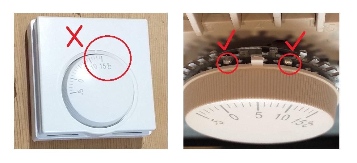
Too often we see frost-protection thermostats set at too high a temperature, meaning that an unoccupied building will be heated for longer, and maintained at a higher temperature, than is necessary for the purpose of preventing water services from freezing.
The diagram on the right shows how a common type of mechanical frost thermostat can be prevented from having too high a switching temperature set. Or from being set dangerously low, for that matter. There is a protrusion on the dial and a series of bendable tabs is provided on a backplate which stop it at either end of the desired travel (in this case +2°C to +6°C). Your electrician will know how to do it.
“See Why Power Companies Are Scared Over This Breakthrough Device That Cuts Your Power Bill By Up To 90%“. Yeah, right. Open up a ‘Voltex’ unit and this what you’ll find: a capacitor. You can ignore the printed-circuit board, whose purpose seems to be solely to power the LED indicator.
Several of my newsletter readers have reported this device to me. Apart from the product being obviously bogus and its claims ludicrous, Voltex’s online marketing is so poor that it’s worth a visit just for a laugh.
It includes video clips that actually show different products: (a) the Power Perfect Box (probably also a capacitor, but bigger) which is shown needing holes drilled in a wall and a connection into a distribution board; and (b) “Greenwave”, which at least is a plug-in device like Voltex but is promoted on the basis of removing dirty electricity and improving your sleep. I kid you not.
Look at the photos of Voltex units and you’ll see that they have retouched the wall sockets to look like UK 3-pin ones but of a pattern nobody has ever seen.
The testimonials from UK customers quote suspiciously-precise savings, but they have forgotten that we don’t use dollars here.
The technology is also supposedly patented – always a warning sign. I asked them for the patent number and their reply was: “the patent is a very complex thing, so in order to be able to sell in multiple places, it’s been decided to risk for the expansion“. What? When I pointed out that this made no sense they elaborated as follows: “For security reasons, we cannot disclose some information related to the product. One of which is the patent number”. So, particularly bearing in mind that they cannot have patented the capacitor, I conclude that there is no patent. They are liars and cheats and it gives me great pleasure to award Voltex the coveted Pants on Fire Award.
Suppose you want to analyse the relationship between consumption and its most significant driving factor, but you know that there is a secondary influence which will distort the result if you don’t take account of it. The easy way to approach this is to analyse historical data statistically using multiple regression, which will estimate the fixed consumption and give you the sensitivities to both variable driving factors.
Unfortunately, in a world where you cannot guarantee that the thing you are analysing has previously behaved in a consistent manner, this statistically-derived guess at the relationship could well be wrong. It will also be unreliable if, for example, the secondary driving factor does not vary very much.
We must bear in mind that statistical analysis has no insight into physical reality and can therefore generate implausible answers. Because of this, I always recommend using non-statistical methods of establishing how consumption responds to variation in a given driving factor. One way is to go back to first principles. Daylight-linked lighting demand provides an excellent example. If you have, say, 500 watts capacity of photocell-controlled lighting, you know for sure that it will use 0.5 kWh for each hour of darkness. Weekly and monthly hours of darkness (HD) can be obtained from standard tables and thus, for any given week or month, you can say how much electricity that lighting installation will use: it’s just 0.5 x HD. What we can do now is ‘net back’ our historical energy consumptions by deducting 0.5 x HD from the metered totals. This removes a calculated allowance for external lighting and the net consumption can then legitimately be analysed against the primary driving factor alone.
Netting-back can be used in other circumstances. On one occasion I was trying to model expected electricity consumption for cooling a computer data centre. Obviously cooling degree days are one driving factor here, but cooling demand would also be sensitive to the amount of electricity fed to the computers housed in the building (for every kWh consumed in the equipment racks, some fraction of a kWh is needed to provide the corresponding cooling). If the rack power were constant week by week, it would not be a problem, as the consequent cooling requirement would appear as part of the fixed electricity demand. On the other hand if it varied widely from week to week it would not be a problem either, because regression analysis would then have a fighting chance. The difficulty was that rack power did vary, but not very often and usually not by very much. The practical solution here was to assume a coefficient of performance for the chillers and to say that their demand would vary by 0.3 kWh per kWh of electricity delivered to equipment racks. Although this was more of an educated guess than an actual measurement, any error in the estimated coefficient was very much diluted in the overall expected-consumption model and on balance the model was more accurate than it would have been if the factor were ignored.
I’ll conclude with a story where regression analysis was problematic and a netting-back approach had to be used.
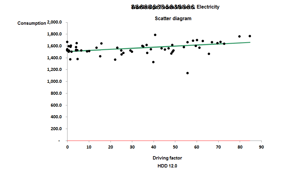
The story concerns an all-electric building which at the outset I had not yet visited, but for which I had energy data. Since no heating fuel was involved, I started by analysing electricity consumption against heating degree days only, which yielded the result shown in Figure 1. Consumption is predominantly fixed:
Figure 1: consumption relative to heating degree days
The gradient of the line, at 1.4 kWh/HDD, was troublingly low. Finding that the building had reversible heat pumps I concluded that I was looking at the combined overlapping effect of seasonal heating and cooling.
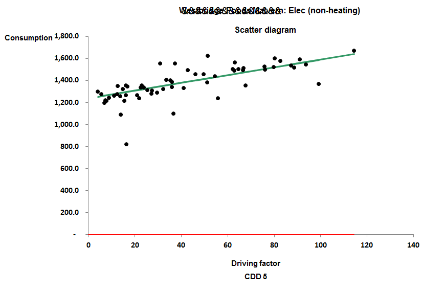
As there was good information on the thermal performance of the building I was able to estimate what the gradient of the line should have been in theory. It came out at 5.8 kWh/HDD. This enabled me to net back the historical totals to get figures for non-heating consumption, which, when analysed against cooling degree days, gave me Figure 2:
Figure 2: non-heating consumption relative to cooling degree days
The gradient of the cooling relationship came out at 3.5 kWh/CDD.
Out of interest I also subjected the data to multiple regression analysis. This yielded an estimate of fixed consumption similar to the other methods but underestimated the coefficients of the two driving factors. It gave a heating degree-day coefficient of 3.6 kWh/HDD (compared with 5.8 based on the building’s physical characteristics) and a cooling coefficient of 1.8 kWh/CDD compared with the 3.5 derived above. It is always problematic when heating and cooling degree days both apply as driving factors, because they are not the completely independent variables that statistical theory demands.
Summary
‘Netting back’ is a useful strategy when consumption has two or more driving factors and you do not want to rely entirely on regression analysis. It is particularly useful when
You have a good method of determining a coefficient from first principles, or empirically from a deliberate test;
You have a known driving factor which varies only slightly or changes infrequently;
You have driving factors that are not completely independent
This article concerns a retail chain in the UK whose stores are a mix of gas-heated and all-electric buildings, any of which could also be using air conditioning to some extent. Their analysts had the task of defining expected-consumption formulae based on historical consumption and degree-day data. The question was what driving factors they should choose: heating degree days, cooling degree days, or both?
For any store with a gas supply, the answer was reasonably obvious: we could expect gas consumption to depend on heating degree days. Furthermore, electricity in those cases was likely either to be driven by cooling degree days or to be weather-insensitive.
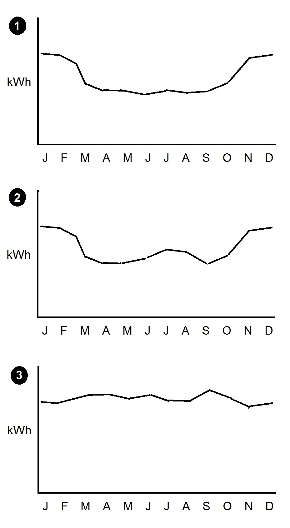
For all-electric stores in general the picture is less clear but the likelihood had to be that heating was the main driver in these cases. This was based on the fact that they were more likely than not to behave like their gas-heated counterparts. So my advice was to treat heating degree days as the primary factor driving week-by-week variation in consumption. After that the only question to answer was whether there was any cooling influence, and that can be answered quickly by looking at the consumption profile through the year. Three scenarios are likely:
1. Higher consumption in winter only. This suggests there is no cooling influence;
2. Higher consumption in winter and summer than in spring and autumn. This clearly indicates a cooling load;
3. Broadly constant consumption all year. This also implies a cooling load.
Why does scenario 3, which shows no seasonal changes, imply the presence of cooling load? Precisely because higher winter consumption is not evident. These buildings must in fact be using heating, but they must also have a seasonal demand for cooling which overlaps the heating season, and adding the two together creates the flat profile.
 MISSING insulation on hot pipework is not just a waste of energy and money. It can cause overheating of the space it occupies, may compromise delivery temperatures, and may even constitute a scalding hazard.