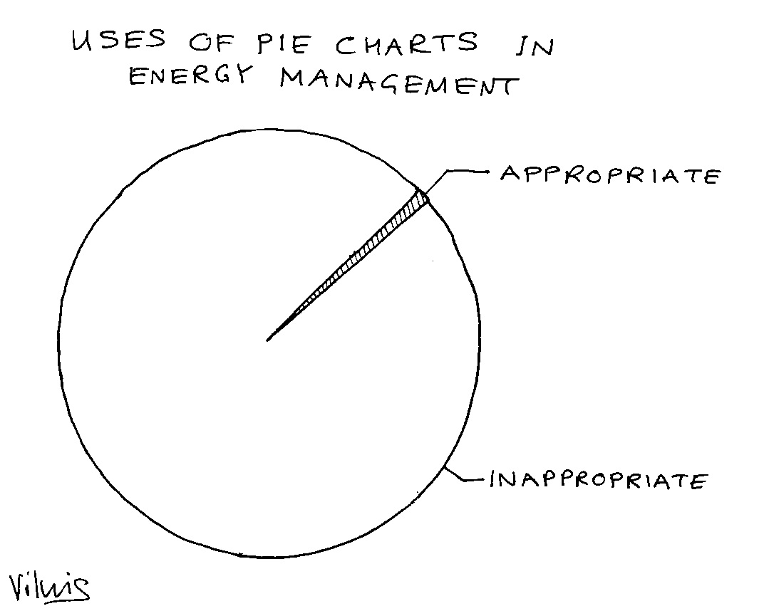
In his highly-recommended book Information dashboard design, data-presentation guru Stephen Few criticises pie charts as being a poor way to present numerical data and I quite strongly agree. Although they seem to be a good way to compare relative quantities, they have real limitations especially when there are more than about five categories to compare. A horizontal bar chart is nearly always going to be a better choice because
- there is always space to put a label against each item;
- you can accommodate more categories;
- relative values are easier to judge;
- you can rank entries for greater clarity;
- it will take less space while being more legible; and
- you don’t need to rely on colour coding (meaning colours can be used to emphasise particular items if needed).
Pie charts with numerous categories and a colour-coded key can be incredibly difficult to interpret, even for readers with perfect colour perception, and bad luck if you ever have to distribute black-and-white photocopies of them.
Data presentation is one of the topics I cover in my advanced M&T master classes. For forthcoming dates click here