League tables are highly unsuitable for reporting energy performance, because small measurement errors can propel participants up and down the table. As a result, the wrong people get praised or blamed, and real opportunities go missing while resources are wasted pursuing phantom problems.
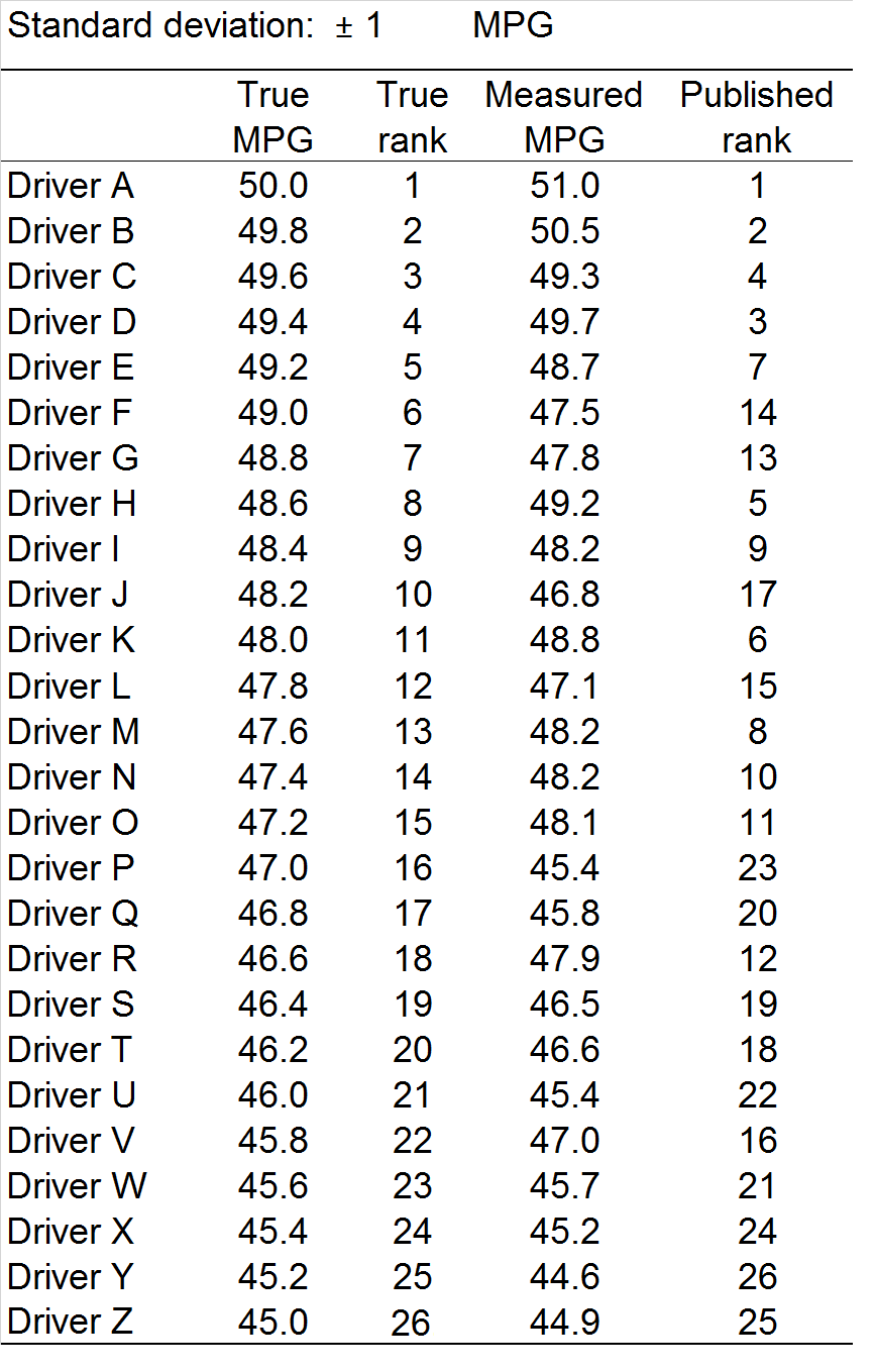
To illustrate this, let’s look at a fashionable application for league tables: driver behaviour. The table on the right (Figure 1) shows 26 drivers, each of whom is actually achieving true fuel economy between 45 and 50 mpg in identical vehicles doing the same duties. This is a very artificial scenario but to make it a bit more realistic let us accept that there will be some error in measurement: alongside their ‘true’ mpg I have put the ‘measured’ values. These differ by a random amount from the true value, on a normal distribution with a standard deviation of 1 mpg — meaning that 2/3 of them fall within 1 mpg either side of the true value, and big discrepancies, although rare, are not impossible. Errors of this magnitude (around 2%) are highly plausible given the facts that (a) it is difficult to fill the tank consistently to the brim at the start and end of the assessment period and (b) there could easily be a 5% error in the recorded mileage. Check your speedometer against a satnav if you doubt that.
In the right-hand column of Figure 1 we see the resulting ranking based on a spreadsheet simulating the random errors. The results look fine: drivers A, B and C at the top and X, Y and Z at the bottom, in line with their true performance. But I cheated to get this result: I ran the simulation several times until this outcome occurred.
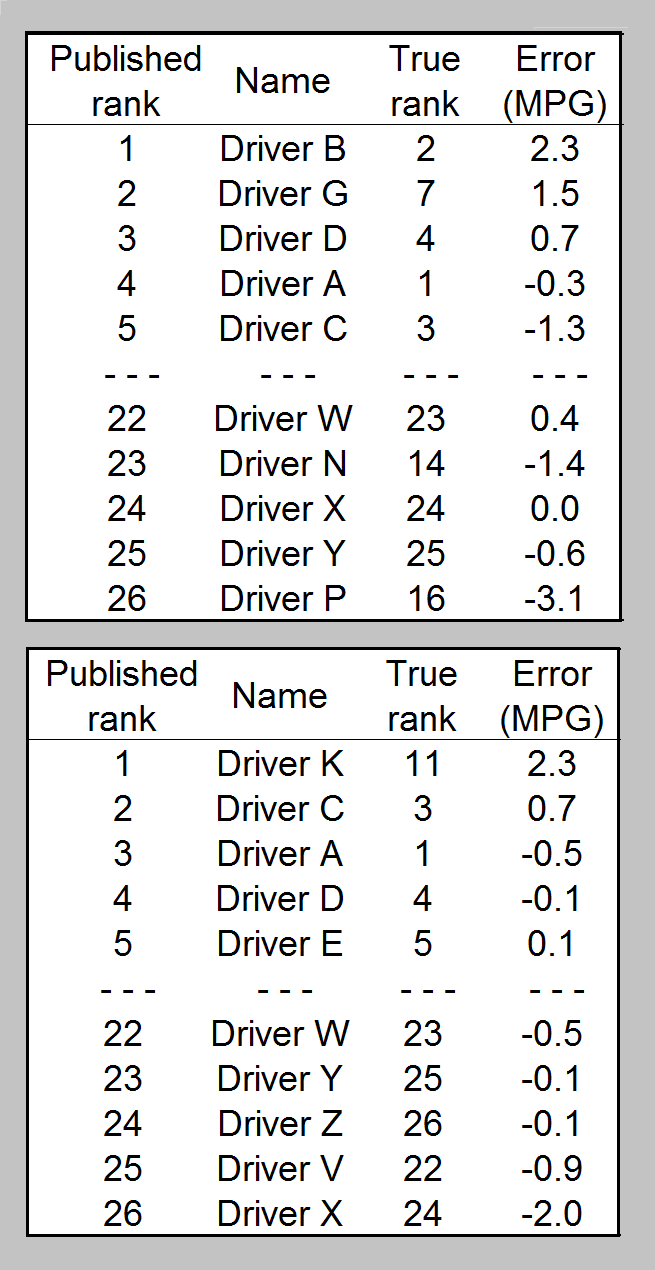
Figure 2 shows an extract of two other outcomes I got along the way. The top table has driver B promoted from second to first place (benefiting from a 2.3 mpg error), while in the bottom table the same error, combined with bad luck for some of the others, propels driver K into first place from what should have been 11th.
In neither case does the best driver get recognised, and in the top case driver P, actually rather average at 16th, ends up at the bottom thanks to an unlucky but not impossible 7% adverse measurement error.
A league table is pretty daft as a reporting tool. The winners crow about it (deservedly or not) while those at the bottom find excuses or (justifiably) blame the methodology. As a motivational tool: forget it. When the results are announced, the majority of participants, including those who made a big effort, will see themselves advertised as having failed to get to the top.
Download the simulation to see all this for yourself.