The widespread adoption of automatic meter reading systems has made huge volumes of fine-grained data available to many energy users. They can be fascinating when you first start seeing patterns of consumption in fine-grained detail, but the novelty soon wears off and the challenge becomes how to use the data without drowning in them.
Let’s talk first about real-time exception reporting. Although various vendors have tried schemes to analyse fine-grained data to identify anomalous consumption in real time, the technical challenges of avoiding false alarms are huge. In any case people tend not to like receiving alerts continually, especially as individual occurrences may have relatively small cost implications. I would therefore argue in favour of using your fine-grained data purely for visualisation, relying on subjective appraisal of the patterns you see. In this regard a ‘heat-map’ chart is my format of choice. It can easily show ten weeks’ half-hourly data in a single screen. This for example is the pattern of a building’s gas consumption between November and January:
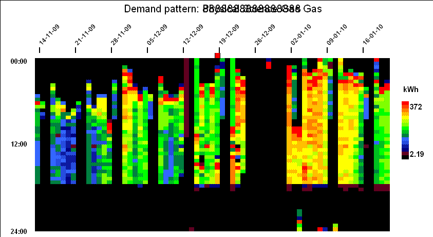
In the chart each vertical slice is one day, running midnight to midnight top to bottom, with each half-hourly cell colour-coded according to demand to create a contour-map effect. This particular example shows:
- Optimised startup time (later starts when the building has not got so cold overnight);
- Off at weekends but with some heating on Saturday mornings;
- Peak output during startup;
- Fixed ‘off’ time;
- Shut-down over Christmas and New Year, with a short burst of frost protection
There are some further examples of real-life heatmaps here.
Finally how to prevent drowning in data. The solution is to filter and prioritise, assessing performance with, say, a weekly review rather than continuously, and using an overspend league table (which I will describe at greater length in a future bulletin) to decide which cases, if any, to review in detail.