DATELINE 1 APRIL, 2021:The Government is keen to nudge people to choose more energy-efficient household appliances and for many years has helped consumers by getting manufacturers to put energy labels on products, typically rating them A to G to signify that they are more or less energy efficient (a concept too complex for most people to grasp). And for people who find the concept of A, B, C etc too complex to grasp they add coloured arrows of different lengths. The shorter the arrow, the higher the efficiency.
The march of progress has caused problems because many products are now more energy efficient than the bureaucrats foresaw. They are crowded into the ‘A’ rating band, and unfortunately there are no letters before A in the alphabet so ‘A’ is now sometimes subdivided into A+, A++ and A+++. However, most people find this concept too difficult to grasp, so the efficiency scales for affected appliances will be regraded A to G so that for example what was A++ will now become B, A will become D, and so on (they will take F off).
Meanwhile a rival scheme for washer-dryers caught my attention. This gives a three-letter rating signifying the efficiencies of washing, spinning, and tumble-drying parts of the cycle. Thus a machine that is in the most efficient category in every respect gets an ‘AAA’ rating. With a bit of forethought they could have started later in the alphabet to allow room for future improvement. They could even have helped people by using the sequences W to Z for Washing, S to V for Spinning, and D to G for Drying. Then a machine currently labelled ‘ABC’ would become ‘WTF’.
Delighted to receive this unsolicited testimonial from a client who is moving to a new job:
“Thanks so much for the fantastic service you have offered over the years. Vesma has consistently provided [our company] with the kind of flexible, responsive service that has met our demand for an innovative approach to energy management time and again. I will continue to recommend your training and consultancy services to others.”
Credit should go to my fellow-director Daniel Curtis who developed the innovative but simple data infrastructure we built our services on, and who was generally the front-line responder when it was needed.
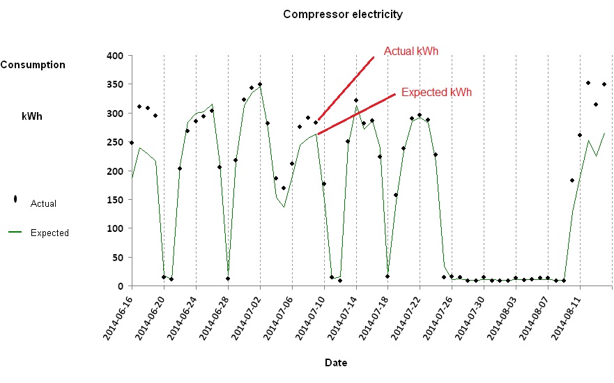
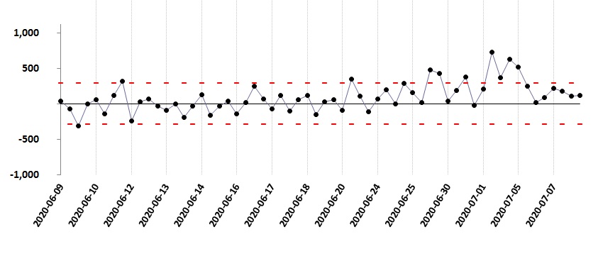
Once you have discovered how to routinely calculate expected consumptions for comparison with actual recorded values, you can get some very useful insights into the energy behaviour of the processes, buildings and vehicles under your supervision. One thing you can do is chart the history of how actual and expected consumption compare. In this example we are looking at the daily electricity consumption of a large air-compressor installation:
Comparison of actual daily consumptions with what they should have been given the output of the compressors
The green trace represents expected kWh (computed by a formula based on the daily air output) and the individual points represent the actual metered kWh. Most of the time the two agree, but there were times in this case when they diverged.
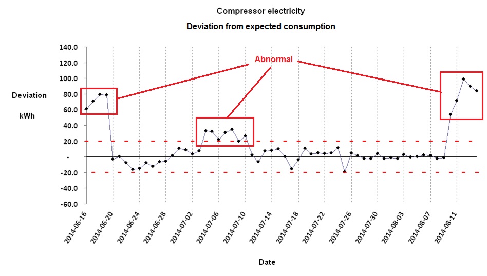
It is illuminating to concentrate on the extent to which actual consumption has deviated from expected values, so in the following chart we focus on the difference between them:
The difference between actual and expected consumption.
There will always be some discrepancy between actual and expected consumptions. Part of the difference is purely random, and the limits of this typical background variation are signified by the red dotted lines. If the difference goes outside these bounds, it is probably because of an underlying shift in how the object is performing. In the above diagram there were three episodes (one moderate, two more severe) of abnormal performance. Significant positive deviations (above the upper control limit) are more usual than negative ones because consuming more energy than required for a given output is much more likely than using less.
For training in energy consumption analysis look for ‘monitoring and targeting’ at VESMA.COM
In a well-constructed energy monitoring and targeting scheme, every stream of consumption that has a formula for expected consumption will also have its own control limit. The limits will be narrow where data are reliable, the formula is appropriate, and the monitored object operates in a predictable way. The limits will be wider where it is harder to model expected consumption accurately, and where there is uncertainty in the measurements of consumption or driving factors. However, it is not burdensome to derive specific control limits for every individual consumption stream because there are reliable statistical methods which can largely automate the process.
Control charts are useful as part of an energy awareness-raising programme. It is easy for people to understand that the trace should normally fall between the control limits, and that will be true regardless of the complexity of the underlying calculations. If people see it deviate above the upper limit, they know some energy waste or losses have occurred; so will the person responsible, and he or she will know that everyone else could be aware of it as well. This creates some incentive to resolve the issue, and once it has been sorted out everyone will see the trace come back between the limits.
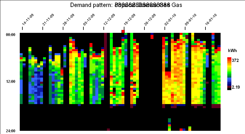
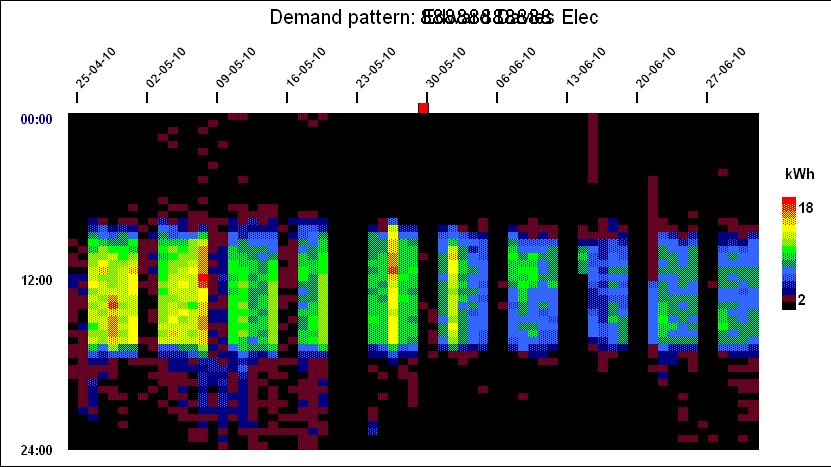
Widespread adoption of automatic meter reading has given many energy users a huge volume of fine-grained data about energy consumption. How best to use it? A ‘heat-map’ chart is a powerful visualisation technique that can easily show ten weeks’ half-hourly data in a single screen. This for example is the pattern of a building’s gas consumption between November and January:
Each vertical slice of the chart is one day, running midnight to midnight top to bottom, with each half-hourly cell colour-coded according to demand . This creates a contour-map effect and when you look at this specifi example, you can see numerous features:
Fixed ‘off’ time;
Optimised startup time (starts later when the building has not cooled down as much overnight);
Peak output during startup;
Off at weekends but with some heating early on Saturday mornings;
Shut-down over Christmas and New Year; and
A brief burst of consumption during the Christmas break, presumably frost protection.
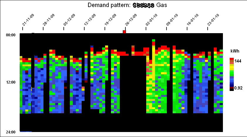
Further examples
This building’s gas consumption pattern is quite similar to the previous one’s (they both belong to the same organisation), but the early-morning startup boost is much more evident and occurs even during the Christmas and New Year break:
Next we have a fairly typical profile for electricity consumption in an office building. What is slightly questionable is the higher daytime consumption near the start (April) compared with the end (June). This suggests the use of portable heaters. Note also that the peak half-hourly demands can easily be seen (Friday of the second week and Wednesday of the fiifth week). In both cases it is evident that those peaks occurred not because of any specific incident but because consumption had generally been higher than usual all day:
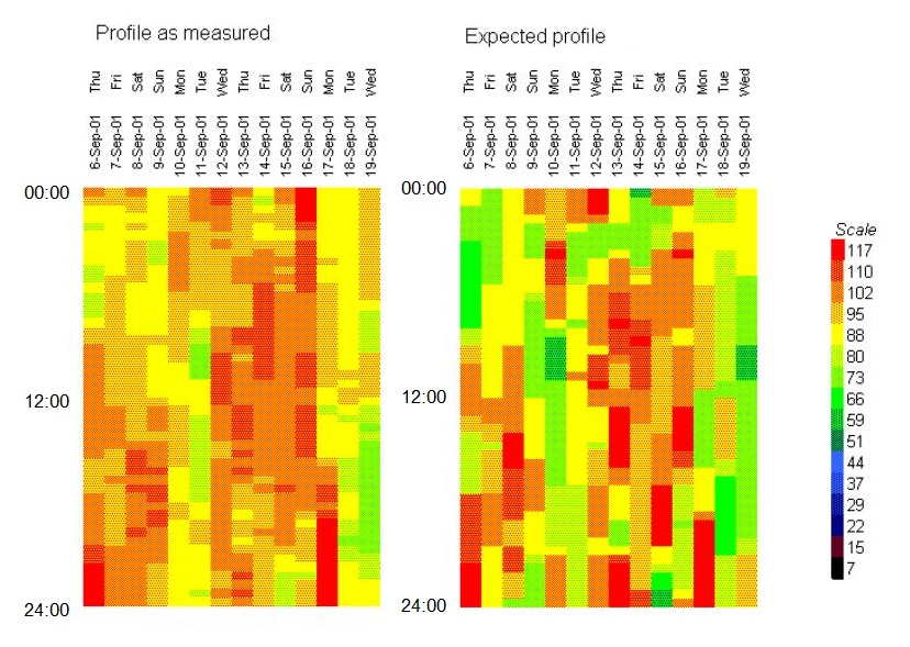
In this final example we are looking at short-term heatmap views of electricity feeding a set of independent batch processes in a pharmaceutical plant. The left-hand diagram is the actual measured consumption while the right-hand diagram is the expected profile based on a mathematical model of the plant into which we had put information about machine scheduling:
This case history shows how fine-grained energy measurements enabled savings to be verified in the face of assorted practical problems.
THE STORY concerns a large air-conditioned establishment in the middle east which had been fitted with adiabatic cooling sprays on its central chillers. It is one of a number belonging to an international chain and my purpose was to establish whether similar technology should be contemplated elsewhere in the chain.
I had originally been commissioned to give a second opinion on the savings claims made by the equipment supplier. Although the claims were quite plausible, they lacked some credibility because they were based on an extremely short evaluation. So in an initial effort at independent checking I obtained several years’ worth of monthly consumption data at the whole-site level and analysed it against local cooling degree days. The results were ambiguous because there appeared to be some unrelated phenomenon at play which resulted in the site toggling on a seasonal cycle between two performance characteristics, one significantly worse than the other, with an impact sufficient to mask the beneficial effect of the energy conservation measure (ECM).
Without reliable evidence I declined to verify the supplier’s assessment, and recommended a deliberate test using a ‘retrofit isolation’ approach based on three existing electricity submeters (one per chiller) and a new heat meter in the common chilled-water circuit. Because nobody wanted to pay for a proper heat meter, a clamp-on ultrasonic flow element was specified. At this point the pandemic struck.
Because we had data-logged metering, and because the adiabatic cooling system sounded as if it would lend itself to being turned on and off, the measurement and verification plan was based on day-on, day-off testing. I had proposed a ten-week testing campaign which would give us 35 observations in each state. The plan called for two regression models to be developed: one for the ECM ‘on’ days and the other for the ‘off’ days. Extrapolation from the regression formulae would indicate a percentage difference and variance within each would confirm how much uncertainty there was.
Then came the collision with reality. The ECM supplier said disabling it wasn’t as simple as turning the cooling sprays off; he insisted that the mesh screens which were part of the installation should come off as well and be reinstated when the spray was re-enabled. This was a quite reasonable stance because it gave a more valid comparison, but unfortunately he couldn’t afford to send a man to site every day to do what was necessary. Meanwhile the establishment’s manager had got wind of the project and put pressure on the site engineer not to disable the ECM, which he was convinced was saving him a lot of money which (thanks to lockdown) the business could not afford to lose. He also had a point. Luckily we agreed a compromise: in exchange for them coming down to a three-day on-off cycle, I promised to monitor things closely and terminate the test as soon as conclusive results emerged.
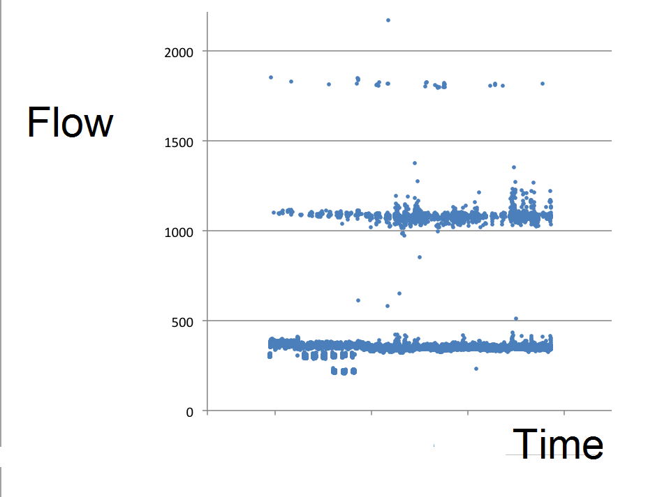
Needless to say, the ultrasonic meter let us down. The technician responsible for downloading its data reported that some of its hourly totals looked suspiciously high, and he proposed filtering them out. But I feared that he might not be able to capture all the rogue points. Some of them might only be slightly wrong, but wrong nonetheless. When we drilled down we discovered that the raw data were stored at one-minute intervals, with the measurement fault manifesting itself as gross errors confined to occasional one-minute records. You can see this from this figure, which spans several months but plots every single one-minute record:
Figure 1: one-minute interval flow measurements fell into three bands during June and July. Only values in the bottom band can be trusted.
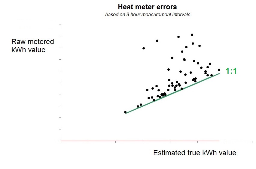
Valid readings at the one-minute interval clearly fell below a threshold of about 450 m3/hr, and abnormal readings were (a) very clear and (b) sparsely distributed through time, so my colleague Daniel Curtis was able to pushed the records through a sieve, take out the lumps and thereby cleanse the data (and that included reinstating hourly values which the meter software had censored because they appeared to be too low). We were helped in this by the flow normally being relatively constant, so that simple interpolation was an accurate gap-filling strategy. When we compared reported flow measurements with corrected values at eight-hour intervals we saw that in reality almost every reported value had been wrong:
Figure 2: raw flow measurements in eight-hour intervals compared with their cleansed values. In the absence of errors all the points would fall on the 1:1 line
Analysis then proceeded using cleaned-up eight-hour interval data, but we were still not out of the woods. From the individual chillers’ electricity meters we could see that the site operations team were changing the chiller sequence from time to time. Fortunately their manager agreed that barring emergencies they could leave the same chillers in service, with the same one in the lead, until the test finished. They also agreed not to change the chilled-water set point temperature, which we discovered they were in the habit of tweaking. Of course in a textbook measurement and verification exercise these static factors would have emerged during planning but this project was being conducted in a hurry on a shoestring and managed remotely. That wasn’t the end of it: later in the test we would have interruptions because the chiller maintenance firm was scheduled to clean the condenser coils. More on that later.
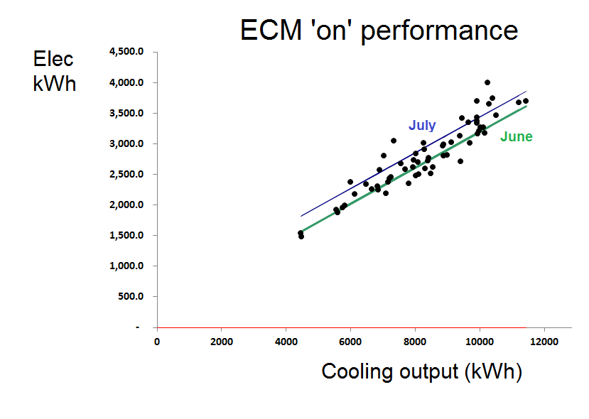
Nor were those the only complications. A few weeks after we started testing in anger in June, the plant did one of its random, unexplained and unexpected changes in energy performance. In Figure 3 you can see the deviation from predicted consumption for intervals when the ECM was active:
Figure 3: deviation from expected consumption, based on performance observed in June
The chillers change their behaviour about two-thirds of the way through this history. If we look at the regression model for the ‘ECM on’ condition we can see the unexplained shift very clearly:
Figure 4: with the ECM active, performance in July was consistently different from what it was in June
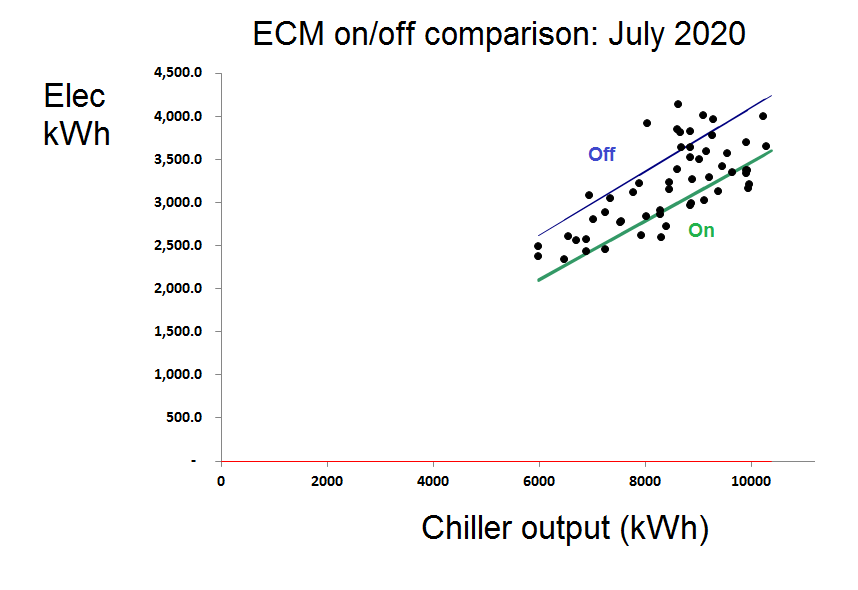
So we ended up, in effect, with two tests: one for June and one for July. Looking now at the comparison between ‘on’ and ‘off’ performance in July alone we saw a clear difference:
A similar picture was obtained from observations made in June and the conclusions were that savings of 16.1% and 17.5% were attributable to the ECM in June and July respectively. However, as a further bonus we observed:
The chiller installation’s performance spontaneously deteriorated by 8% at the end of June, echoing behaviour first witnessed in 2019. Identifying the cause will probably save money quite easily; and
Cleaning the condenser coils made no difference to performance. They were probably clean and it was a waste of money, so I suggested not cleaning them until condenser temperatures started to rise.
What lessons would I draw from this episode? That the verifier needs to be vigilant, sceptical, and cautious but flexible. In fact flexibility is needed on all sides, and that is best served by developing trust; trust in this case was built up through openness and continuous communication.
ENERGY surveys and audits – deliberate studies to find energy-saving opportunities – can be done with three levels of depth and thoroughness, can look at three broad aspects of operations, and will generally adopt one of three approaches.
Depth and thoroughness
Let’s take depth and thoroughness first. Level 1 would be an opportunity scan. This typically has a wide scope, and is based on a walk-though inspection. It will use only readily-available data, and provide at most only rough estimates of savings with no implementation cost estimates. It will yield only low-risk recommendations (the “no-brainers”) but should identify items for deeper study.
Level 2 is likely to have a selective scope (based perhaps on the findings from a Level 1 exercise). It is best preceded by a desktop analysis of consumption patterns and relationships, which means first collecting additional data on consumption and the driving factors which influence it. It should yield reasonably accurate assessments of expected savings but probably at best only rough cost estimates. It can therefore provide some firm recommendations relating to ‘safe bets’ and otherwise identify possible candidates for investment.
Level 3 is the investment-grade audit. This may have a narrow scope – perhaps one individual project – and will demand a sketch design and feasibility study, with accurate assessments of expected savings, realistic quotations for implementation, sound risk evaluation and (I would recommend) a measurement and verification plan.
Aspects covered
Next we will look at the three broad aspects of operations that the audit could cover. These are ‘technical’, ‘human factors’, and ‘procedural’.
Technical aspects will encompass a spectrum from less to more intrusive (starting with quality of automatic control and set points through energy losses to component efficiencies). In manufacturing operations the range continues through process layouts, potential for process integration and substitution of alternative processes.
Human-factors aspects meanwhile will cover good housekeeping, compliance with operating instructions, maintenance practices, training needs and enhanced vigilance.
Thirdly, procedural aspects will include the scope for improved operating and maintenace instructions, better plant loading and scheduling, effective monitoring and exception handling, and ensuring design feedback.
Approaches to the audit
The final three dimensions relate to the audit style, which I characterise as checklist-based, product-led, or opportunity-led.
The checklist-based approach suits simple repetitive surveys and less-experienced auditors.
Product-led audits have a narrow focus and exploit the expertise of a trusted technology supplier. Because the chosen focus is often set by advertising or on a flavour-of-the-month basis, the risk is that the wrong focus will be chosen and more valuable opportunities will be missed. Or worse still, the agenda will be captured by snake-oil merchants.
Finally we have the ‘opportunity-led’ style of audit. This is perhaps the ideal, although not always attainable because it needs competent auditors with diverse experience and will include the prior analysis and preliminary survey mentioned earlier.
These ideas, together with other advice on energy auditing, are to be covered in a new optional add-on module for my “Energy efficiency A to Z” course which explais a wide range of technical energy-saving opportunities. Details of all my forthcoming training and conferences on energy saving can be found at https://vesma.com/training.
Note: this guidance was developed because of the Covid-19 pandemic. However, by its nature, the pandemic is an unexpected major non-routine event which will in many cases completely invalidate baselines developed before March 2020. Readers should not expect this advice to remedy the resultant disruption to evaluations. It may prove to be applicable only to ‘retrofit isolation’ assessments and trials using extended sequences of on-off mode changes.
THIS GUIDANCE proposes enhancements to standard measurement and verification protocols to cover the situation where, for reasons beyond the control of the parties involved, a measurement and verification practitioner (MVP) is unable to participate in person.
Firstly the proposal for the energy-saving project should indicate not only the quantity or proportion by which consumption is expected to be reduced, but wherever possible the nature of the expected reduction. For example where data are to be analysed at weekly or monthly intervals, it may be possible to say whether reductions are expected in the fixed or variable components of demand or both; while for data collected at intervals of an hour or less it may be possible to define the expected change in daily demand profile or other parameters related to the pattern of demand.
Setting the expectations more precisely in this manner will help the MVP to detect whether post-implementation results may have been affected by unrelated factors.
Secondly a longer period than usual of pre-implementation data should be collected and analysed. This is necessary in order not only to establish prevailing levels of measurement and modelling uncertainty, but potentially to expose pre-existing irregularities in performance. Such monitoring should employ the same metering devices which will be used for post-implementation assessment.
The causes of historical irregular performance should be traced as they could provide clues about foreseeable non-routine events (NRE) which would then need to be allowed for in post-implementation assessment in case they recur. If NREs are not adequately allowed for, they will at best degrade the analysis and at worst lead to incorrect conclusions.
Thirdly, all parties should remember that as well as foreseeable NREs, there will be unforeseen ones as well. Dealing with is part of standard practice but because the appointed MVP is unable to visit the subject site and interview key personnel, he or she is likely to miss important clues about potential NREs which otherwise would have been evident based on his or her professional experience. It is therefore imperative that a planning teleconference takes place involving local personnel who are thoroughly conversant with the operation and maintenance of the facility. As part of this meeting a knowledgeable client representative should provide the MVP with a clear account of how the facility is used with particular emphasis on non-standard situations such as temporary closures. Pertinent input from client representatives at large would include (to give some examples) control set-points, time schedules, plant sequencing and duty-cycling regimes, occupation patterns, the nature and timing of maintenance interventions and so on. Information about other projects—both active and contemplated—should be disclosed. The MVP has a duty to probe and ask searching questions. It should never be assumed that something is irrelevant to the matter in hand and as a general rule no question asked by the MVP should go unanswered.
It may be helpful to provide the facility of a walk-through video tour for the benefit of the MVP, which can of course be on a separate occasion.
In a recent newsletter I suggested that somebody wishing to monitor the health of their solar PV installations could do so using ‘back-to-back’ comparisons between them. Reader Ben Whittle knows a lot more about these matters and wrote to put me right. His emails are reproduced here:
I would point out that whilst it may possibly be interesting to compare solar installations and account for cloud cover, personally I wouldn’t bother!
variable cloud cover is variable – you can’t control it and generally it is fair to say that annual variation in the UK rarely deviates +/- 5% annually
if you have a monitoring system, it will be capable of telling you when there is a fault immediately by email rather than waiting to do analysis
In the case of inverter manufacturers’ own monitoring systems they will directly report faults immediately , usually based on
an actual fault code being generated by the inverter – typically either being switched off and failing to report at all, string insulation resistance faults or other major failures
output not matching other inverters in the same installation or sometimes against a base case / prediction based on yield expected due to weather forecasts
possibly against a self defined target, and a failure to meet it
Third-party monitoring manufacturers will typically do the same as inverter manufacturer monitoring (with the exception of not reporting actual fault codes), but they have the advantage of being able to report on installations with mixed inverter manufacturers being used (possibly new + historic installations in one location or a portfolio of installations from different installers)
One classic mistake made with solar monitoring information is having no clear idea of what and how you are going to deal with all the information! It is time consuming to do and takes a bit of experience to make sense of it all.
So I asked Ben if there was a cost attached and this was his reply:
Most inverter manufacturers provide a solution. Three of the biggest brands (SMA, Fronius, SolarEdge) all have very competent systems, which are hosted for free, but you can get additional services by paying extra.
A typical domestic setup (which could cover any installation to any size in theory) would have basic info on annual, monthly and daily yield, and may also display self consumption rates assuming you have bought the requisite sub meter. Other info can include energy sent to a battery if you have one. It would also notify you if you lost grid connection, or communication faults. Communication is typically managed over wifi for domestic set ups and ethernet in commercial set ups. Remote solar farms do all this over 3g or 4g if there is no nearby telephone infrastructure.
Where you would pay money for a service is for an enterprise solution: this would allow you to also compare multiple installations and give you more detailed performance info, possibly also automating equipment replacement or engineer visits if malfunctions were being detected. (You would only get this from the major manufacturers with a dedicated team in this country, or an O&M service provider who was being paid to keep an eye on performance).
Third party systems typically only work using generation meter and export meter info, but a surprising amount of knowledge can be gleaned from this – you are after all only trying to find anomalies and once you have defined the expected performance initially this is quite straightforward. The advantage of this is that if you are managing lots of different installations with different inverters then you can pull the data all into one database. Big O&M companies may insist on this being added where a service level is being defined – such as 98% availability or emergencies responded to in under 24 hours. The service will also include additional data points such as pryanometer info and other weather data, depending on the scale of the installation.
The companies who operate big solar farms are often hedge funds and they don’t like leaving systems down and not running for any length of time given the income from feed in tariffs. Though they quite often don’t manage the farms as well as they could do…
Ben Whittle (07977 218473, ) is with the Welsh Government Energy Service
Clamp-on ultrasonic flow meters are tricky things to deploy and I always get a sinking feeling when somebody says they’re going to use them. In this case they were fitted to measure cooling energy as part of a measurement and verification project. Provisional analysis in the early weeks of the project showed that all was not well: there were big apparent swings in performance, which were unrelated to what we knew was going on on the plant.
Data from the meters, which were downloaded at one-minute intervals, contained computed kWh values which I was consolidating into hourly totals. The person sending me the data was extracting the kWh figures into a spreadsheet for me but some instinct prompted me to request the raw data, which I noticed contained the flow and temperature readings as well as the kWh results. My colleague Daniel wrote a fast conversion routine which saved our friend the trouble and we discovered that there were occasional huge spikes in the one-minute kWh records which were caused by errors in the volumetric flow rates. The following crude diagram of the minute-by minute flows over several weeks shows that as well as plausible results (under 500 cubic metres per hour) there were families of high readings spaced at multiples of about 750 above that:
The discrepancies were sporadic, rare, and clearly delineated so Dan was able to modify his software to skip the anomalous readings and average over the gaps. We were lucky that flow rates and temperatures were relatively constant, meaning that the loss of an occasional minute per hour was not fatal. He also discovered that the heat meter was zeroing out low readings below a certain threshold, and he plugged those holes by using the flow and differential-temperature data to compute the values which the meter had declined to output.
The next diagram shows the relationship between the meter’s kWh output, aggregated to eight-hourly intervals (on the vertical axis) with what we believe to be the true readings (on the horizontal axis). The straight line represents a 1:1 relationship and shows that, quite apart from the gross discrepancies, readings were anomalously high in almost every eight-hour interval.
Relationship between raw eight-hourly kWh and the estimated true values
The effect on our analysis was dramatic. Instead of erratic changes in performance not synchronised with the energy-saving measure being turned on and off, we were able to see clear confirmation that it was having the required effect.
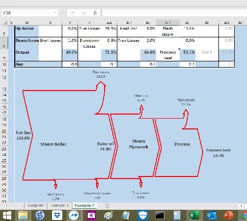
Sankey diagrams depict the flows of energy through a system or enterprise using arrows whose widths are proportional to the magnitudes of the flows.
My friend and former colleague Kevin Cardall recently challenged my newsletter readers to come up with improvements on an Excel-based Sankey Diagram generator which he had devised (illustrated right, and attached here). His work was inspired by this website. Reader David B. responded rapidly with a neat enhancement but we also had a number of alternatives suggested by other readers.
Readers’ recommendations
When the subject of Sankey diagram software came up in 2003 one of my clients recommended SDRAW. It is a commercial product but there is a free demonstration version.
Readers Colin G., Gary C. and Chris S. mentioned a free online tool, http://sankeymatic.com/and reader Andy drew my attention to this toolkit for those who want to do it in Excel.